FY26 Readiness
A badge collection experience designed inside Oracle’s own platform and design system.
- UX/UI Designer
- May – Jun 2025
- Embedded in Oracle’s internal platform
- Information architecture · Reusable badge component · State model · Edge-case handling
Designing inside a product I did not own
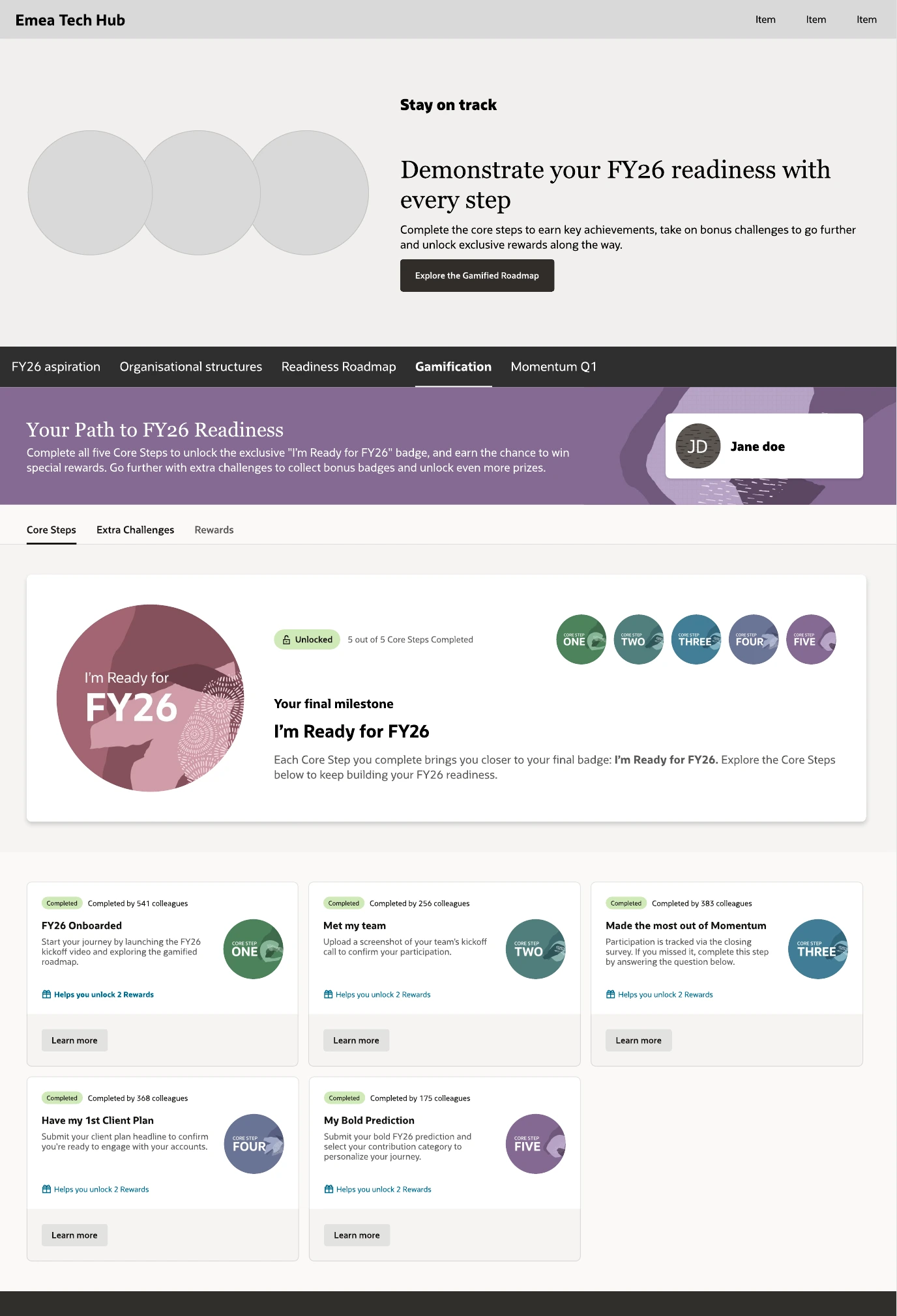
Oracle did not use Passport. POAP Studio designed a badge-collection experience directly inside Oracle’s internal platform, using Oracle’s own design system: a bespoke embedded enterprise experience, not a white-label implementation.
That constraint is the whole interest of the case. Every decision had to survive an existing component library, an existing page template, an existing navigation, and a host team with their own priorities.
- Core Stepsfive, sequential
- Extra Challengesoptional, bonus
- Rewardsunlocked by steps
- Final badgeI’m Ready for FY26
Where the component sits changes what it means
Place the milestone above the steps, not below them
The gamified block had to be inserted into a page that already had an owner, a hero and a purpose. Put it at the bottom and it reads as an appendix nobody scrolls to. Put it at the top and it competes with the host page’s own message.
I prototyped both placements at full page scale rather than arguing about them, and put the milestone card directly under the section navigation: high enough to be seen on load, low enough that it never fights the host hero. The core-step cards then flow underneath in their natural reading order.
The unglamorous half of enterprise UX
Most of this project was edge cases.
A badge system inside a corporate platform spends most of its life in states nobody demos: a step completed but not yet verified, a modal dismissed mid-flow, a CTA that is disabled for a reason the user cannot see, a milestone that must not fire its celebration twice.
If your product has more rules than screens, we should talk.