POAP Passport
From branded collectible hunts to a configurable phygital experience platform.
- 20+
- 3
- V1 · V2
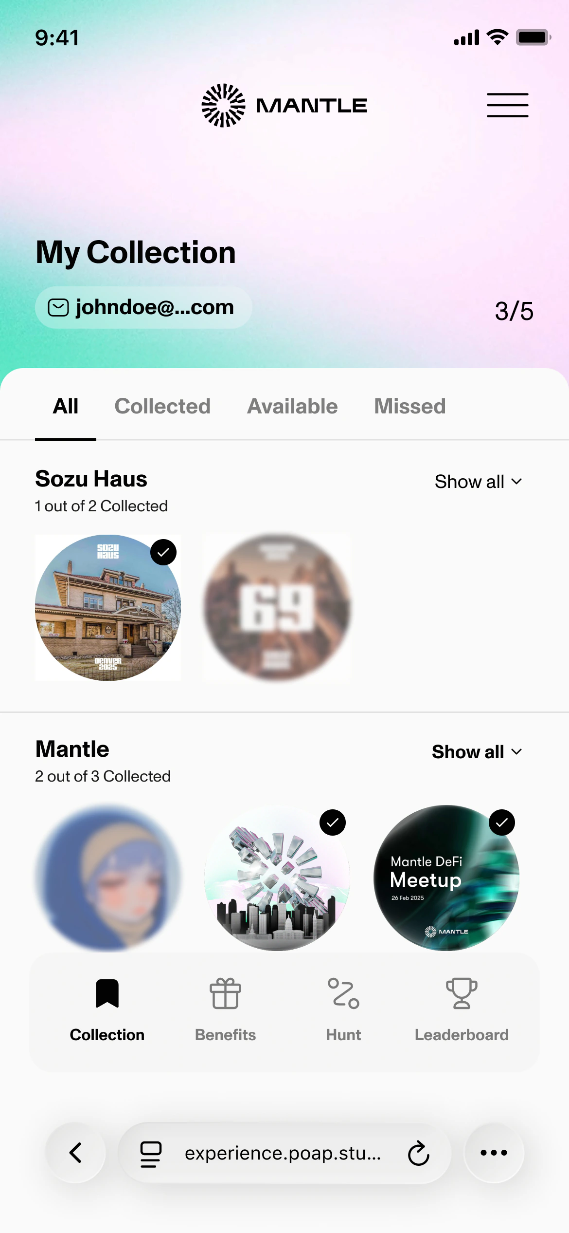
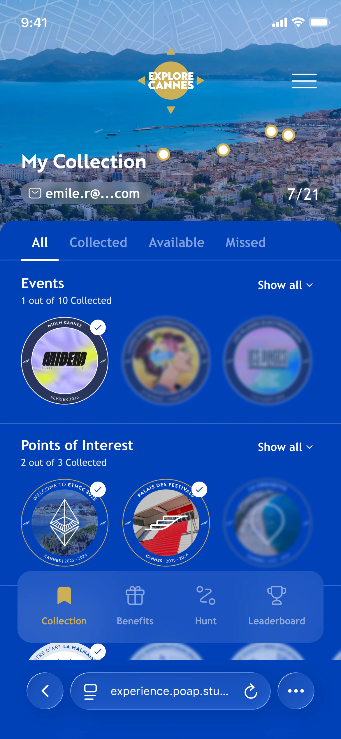
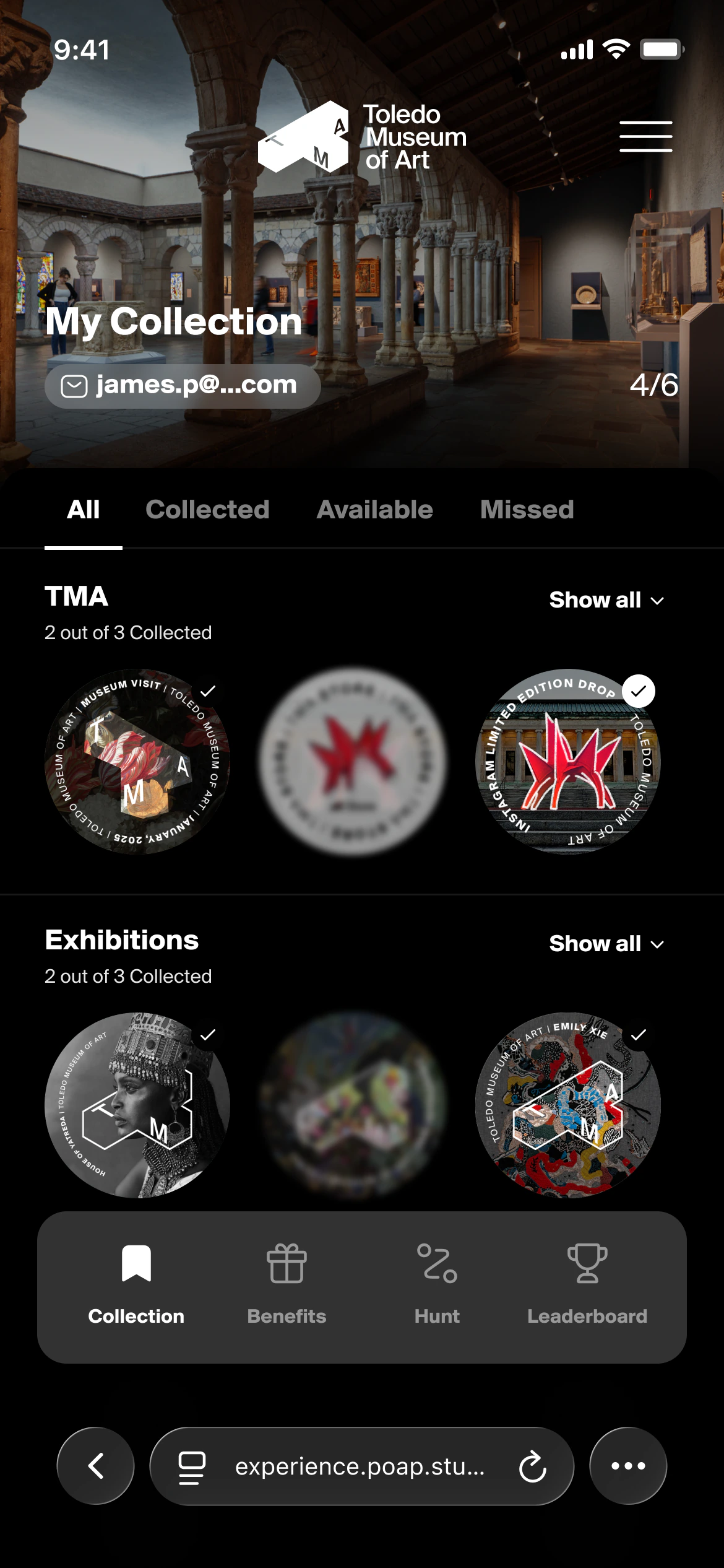
- Sole UX/UI Designer
- 2023–2026
- V1 and V2 launched
- Information architecture · User flows · Interaction design · UI · White-label system · Backoffice logic · Handoff
Why a reusable system was needed
POAP Studio initially built tailored collectible hunts for individual brands and events. The first Passport front-end started from a detailed product brief and a set of basic wireframes defining the main user-facing sections. I designed that interface and proposed improvements to the initial structure. In parallel, I conceptualised and designed the backoffice from scratch: the product that would let the team configure and build Passport experiences without developing each one as a bespoke implementation. As requirements diversified, that backoffice, the participant platform and a white-label framework became the three pieces this case follows, from a backoffice decision to a system behaviour to a participant outcome.
The challenge was never to make each Passport look different.
It was to stay legible for both participants and administrators while each activation differed in branding, rules, collection structure and rewards.
V1: establishing the participant model
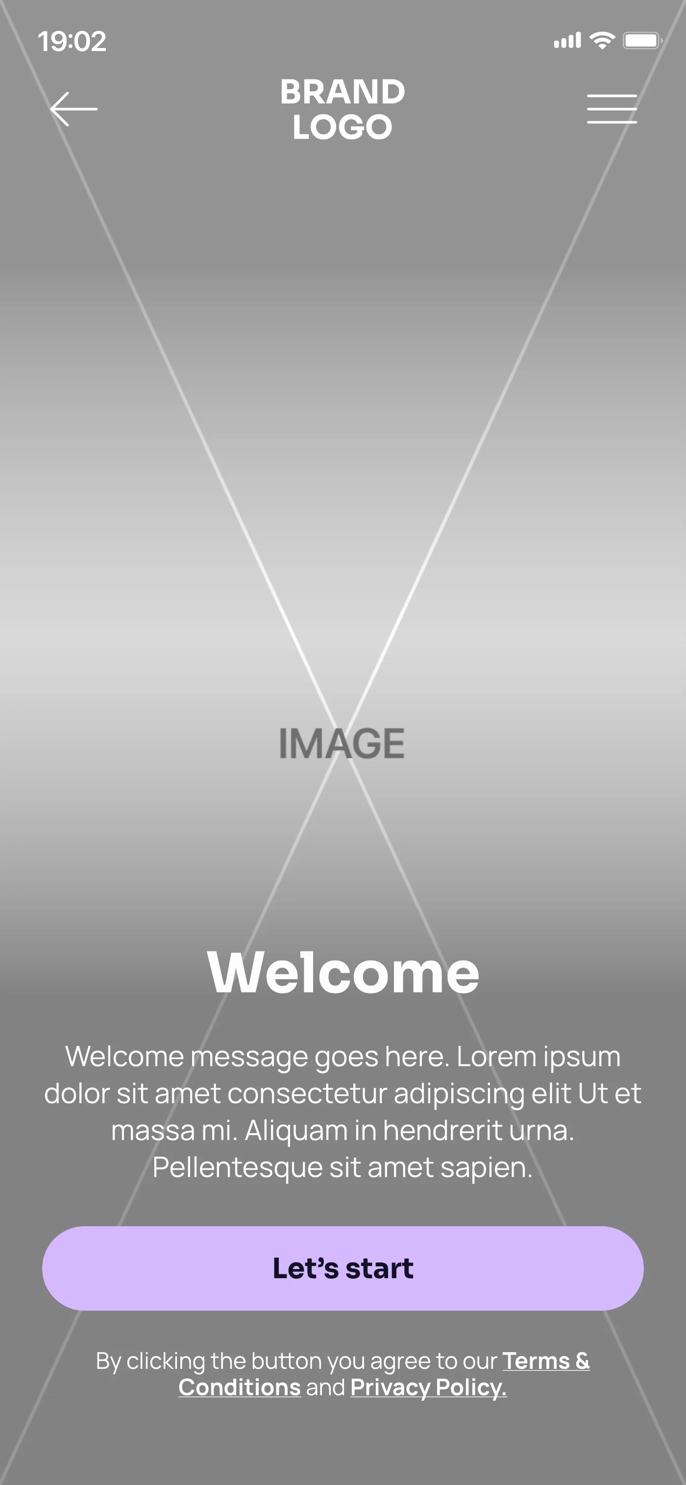
The first version, built through 2023, focused on branded collectible hunts. Participants could join a Passport, discover available collectibles, track progress, unlock benefits and compare progress through leaderboards.
Make the three states readable at a glance, in any brand
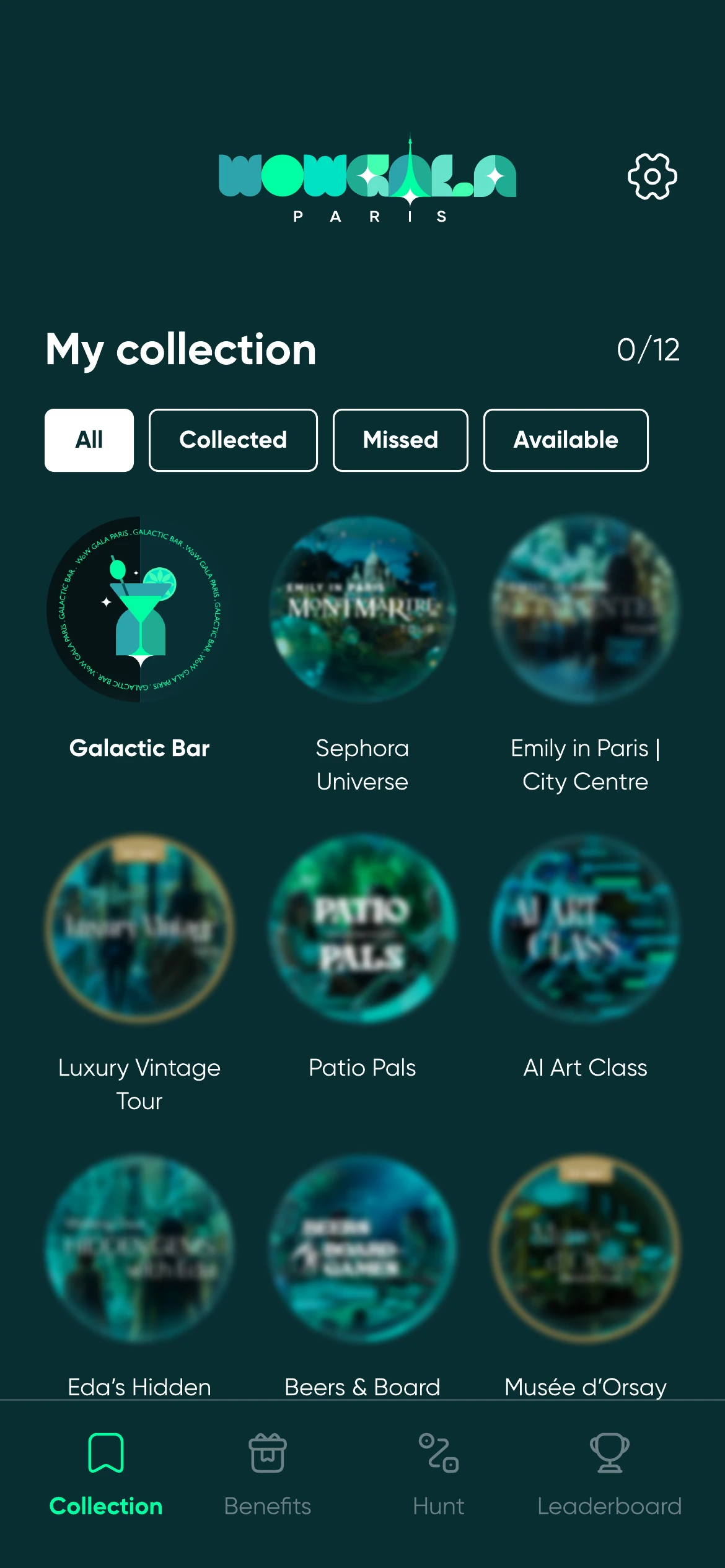
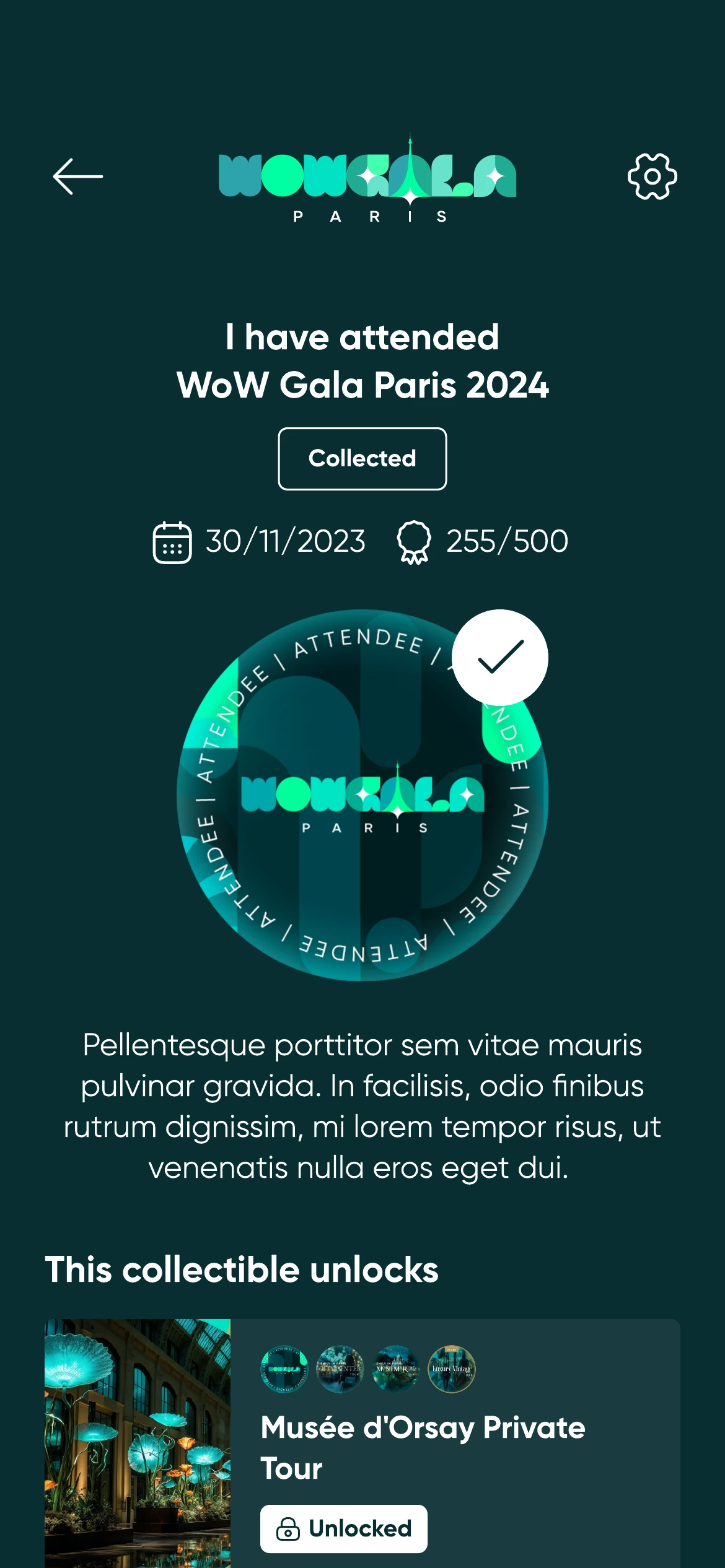
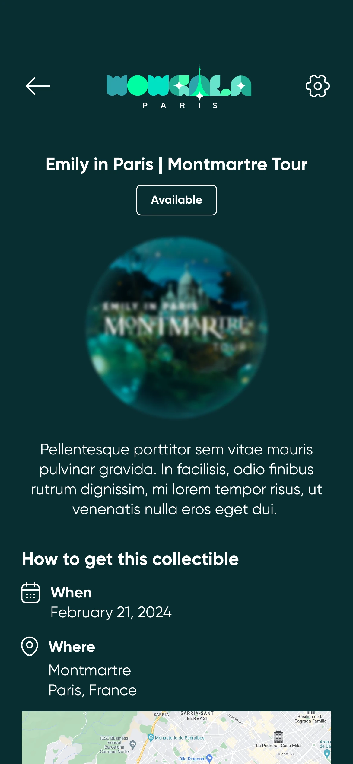
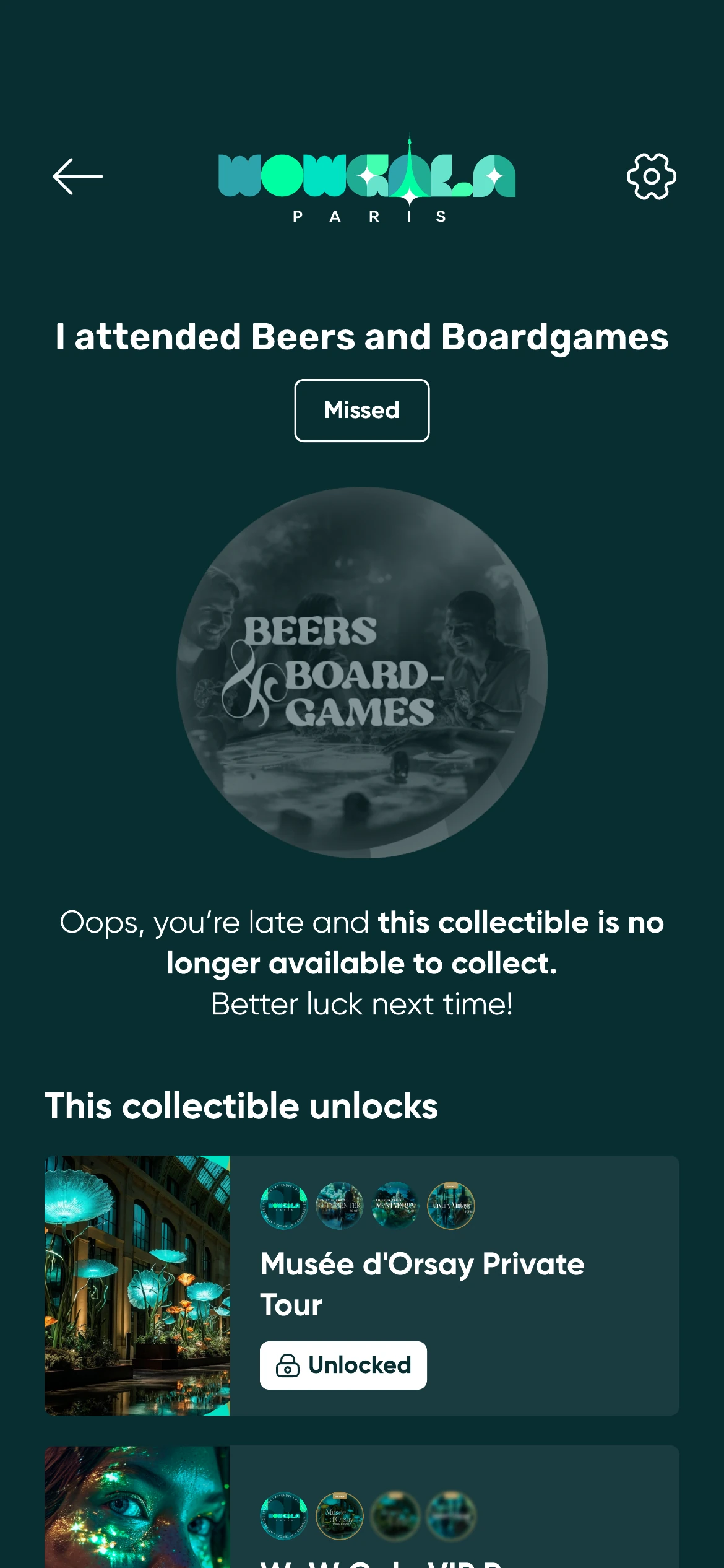
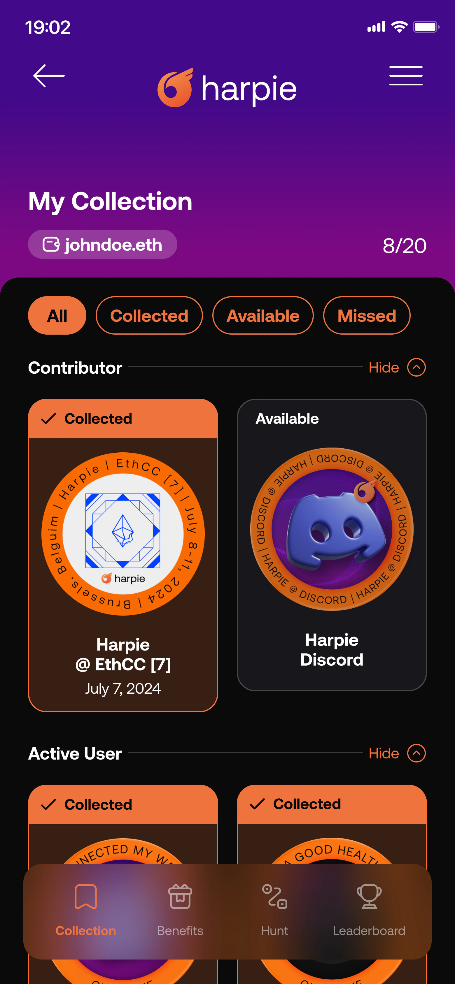
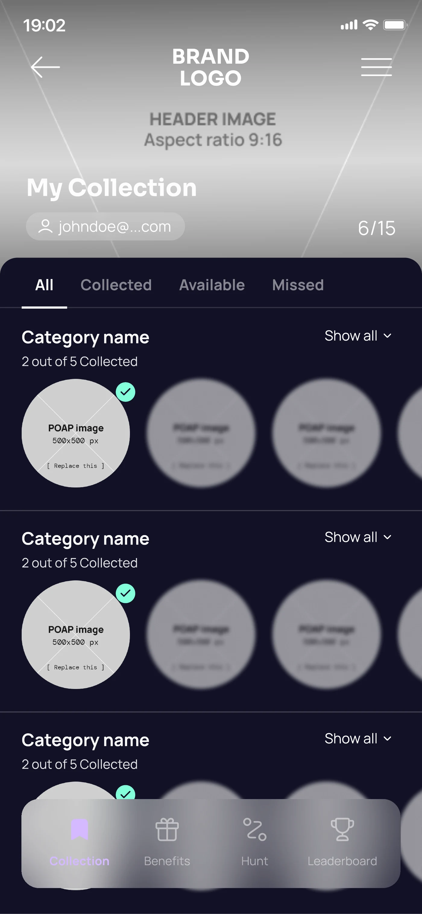
A hunt is only legible if a participant can see the whole set at once: what they hold, what is still within reach, and what has closed. That is what the collection grid is for, and it is where progress gets read. But at grid size there is no room for a label, and every brand supplies its own artwork, so whatever separates the three states has to survive being drawn by somebody else.
I gave the states a visual language rather than a label. Collected renders in full colour with a tick. Available renders in colour with a blur, so it reads as something still out of reach. Missed drops to black and white. A brand can inherit that language and get correct states for free, or upload its own image per state when it wants the control. Either way the grid stays readable, and the detail screen behind each item carries the rest: what a collected item unlocked, when and where to get an available one, and why a missed one is closed.
Benefits were the reason to collect. The requirement list on the benefit and the redemption moment are the two halves of that promise, so they were designed as a pair, not as separate screens.
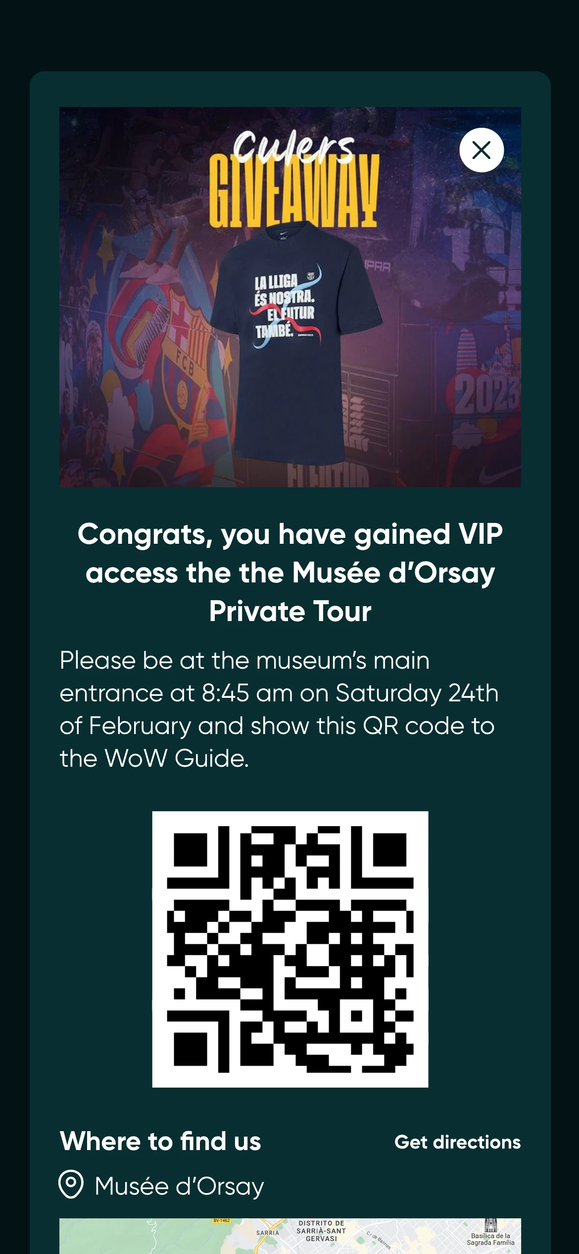
What broke as requirements grew
The limitations of V1 came out of running it. Some a brand asked for directly, in the middle of planning an activation. Others we inferred from what had already happened: where participants stopped, what an administrator kept getting wrong, what a client asked us to do by hand because the product could not do it yet. A few were our own, added because we wanted the platform to reach further than the projects in front of us. Most were not.
- Customisation was insufficient for increasingly diverse brand identities.
- Collections needed richer internal structure and categories.
- Benefit logic needed more than simple requirements.
- Rewards required stock, multiple types and more flexible unlock mechanisms.
- Some projects required bespoke implementations outside the standard product.
V2: scaling configurability
In 2024, V2 turned Passport from a hunt template into a configurable platform. Three things that had been fixed became variables: how a collection is grouped, what a benefit depends on, and what a reward is and how many of it there are.
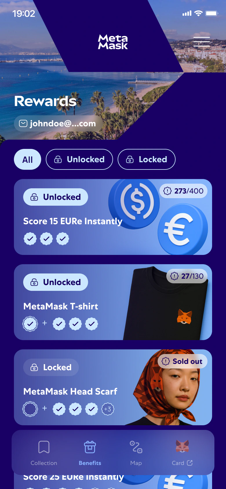
Make requirement logic readable instead of hiding it
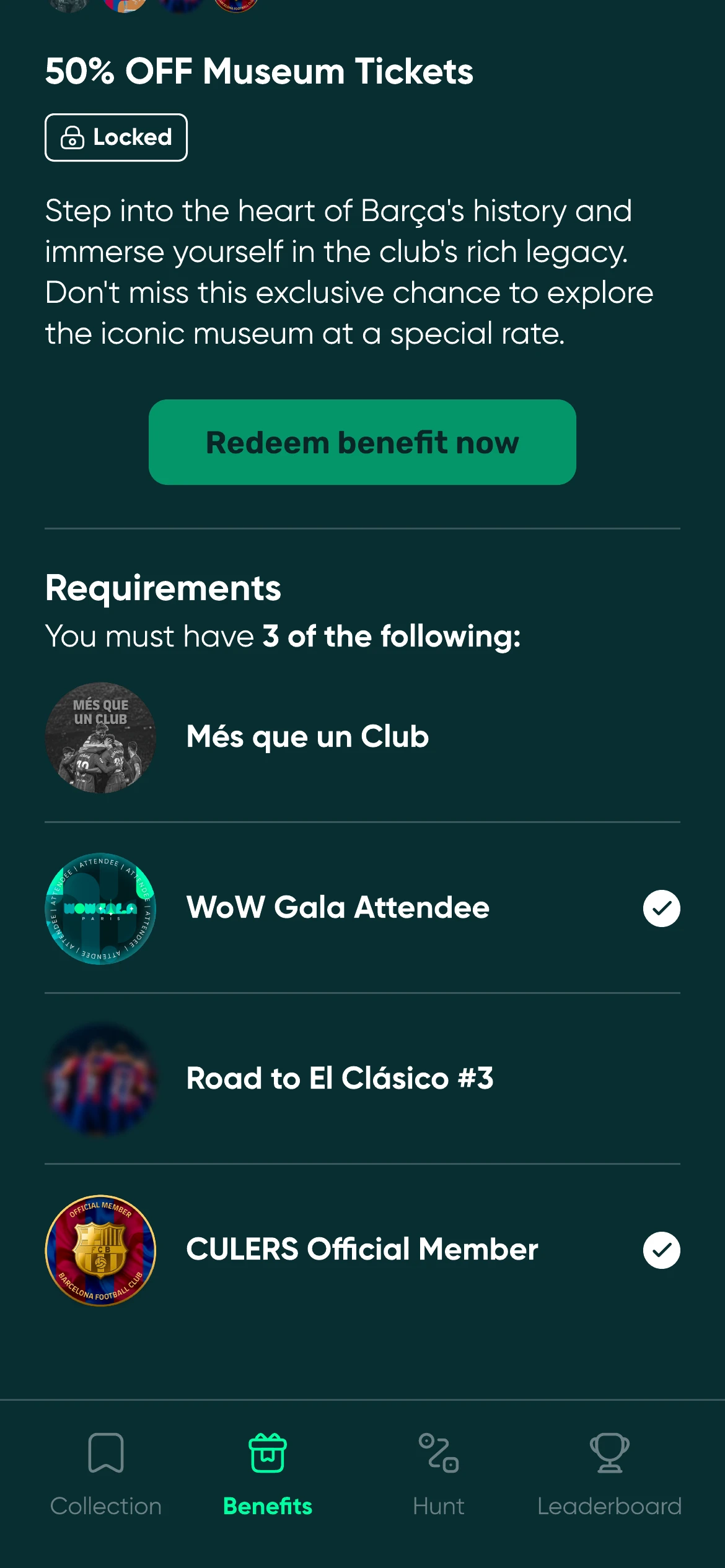
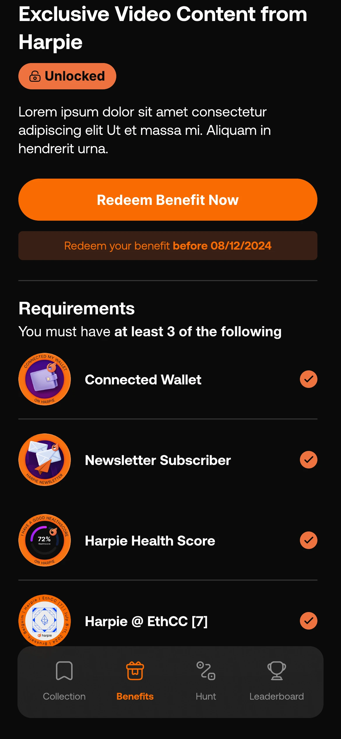
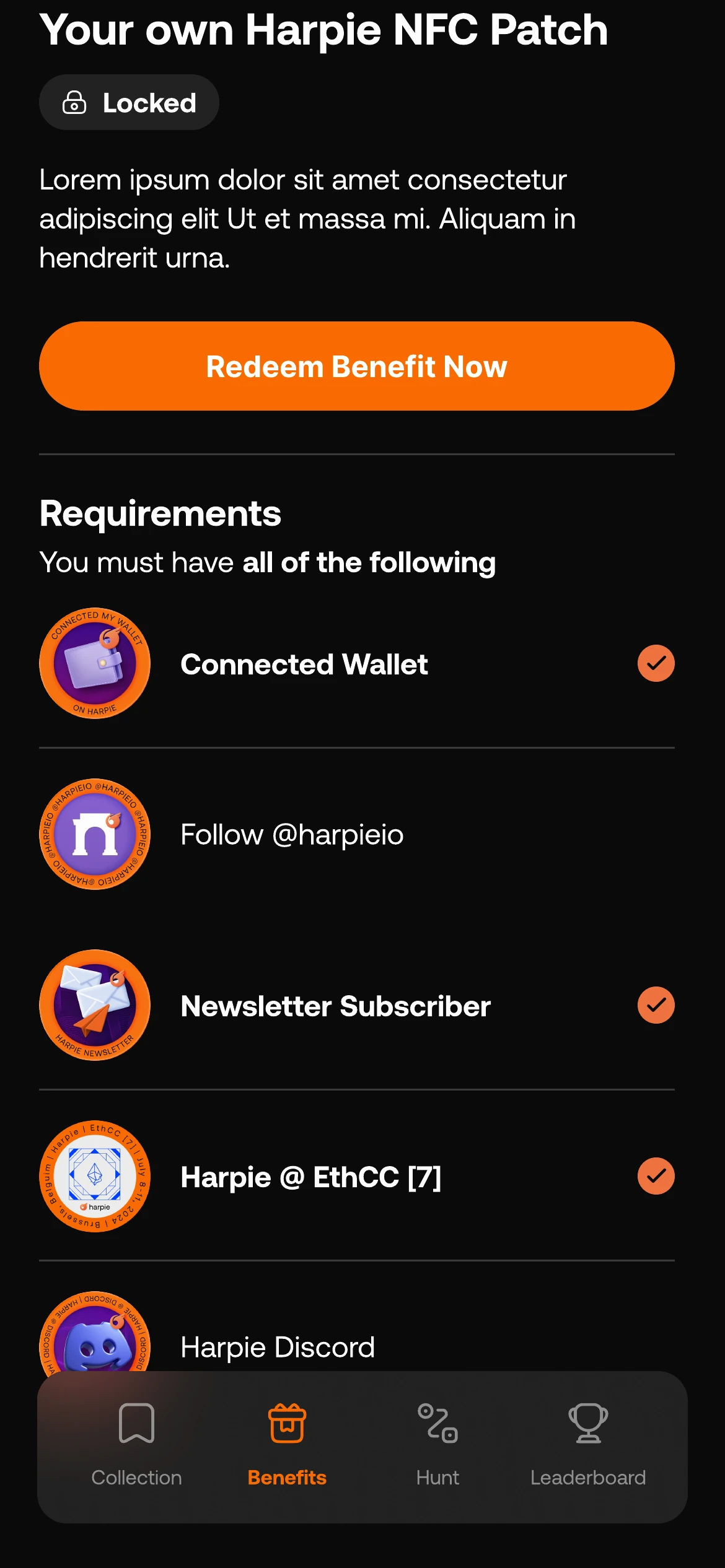
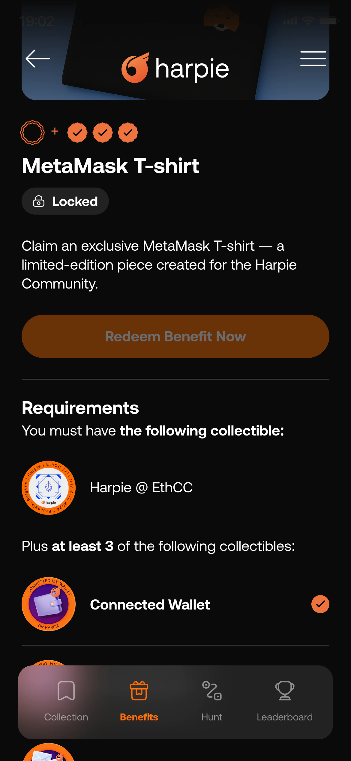
Benefits could now depend on any combination of collectibles: all of them, some of them, or at least one. Expressing that in an interface usually turns into either a hidden rule or an unreadable formula.
I put the rule on the benefit itself, as a checklist the participant can verify item by item. The sentence above the list states the logic in plain language, and each row carries its own state. One pattern renders every combination the backoffice can produce. V3 later added mandatory items, a rule that pins specific collectibles instead of counting them, and the checklist did not have to be redesigned to take it: the mandatory one gets a badge of its own and a plus sign separates it from the ones being counted.
Configuration → behaviour → participant outcome
The backoffice and the participant product are not two sets of screens. An administrative decision creates a system behaviour, which produces a participant state. Designing that chain is the actual work.
- Organisationwho owns it
- Projectone experience
- Setup & brandingreusable variables
- Collectibleseligibility, timing
- Benefitsunlock logic
- Participantstate and progress
| Backoffice configuration | System behaviour | Participant outcome |
|---|---|---|
| Branding, fonts and media | Reusable visual variables and assets | A Passport that reads as the client’s own product. |
| Collectible, category and availability | Placement, state and timing rules | Collected, available or missed. |
| Benefit requirements | All / some / at least one; mandatory items | A locked or unlocked reward with visible progress. |
| Inventory and redemption | Limited stock and redemption status | Availability, urgency and claim state. |
| Location or collection method | Permission, validation and error handling | The right claim flow, and its edge cases. |
Make collecting feel like receiving something, not filing a form
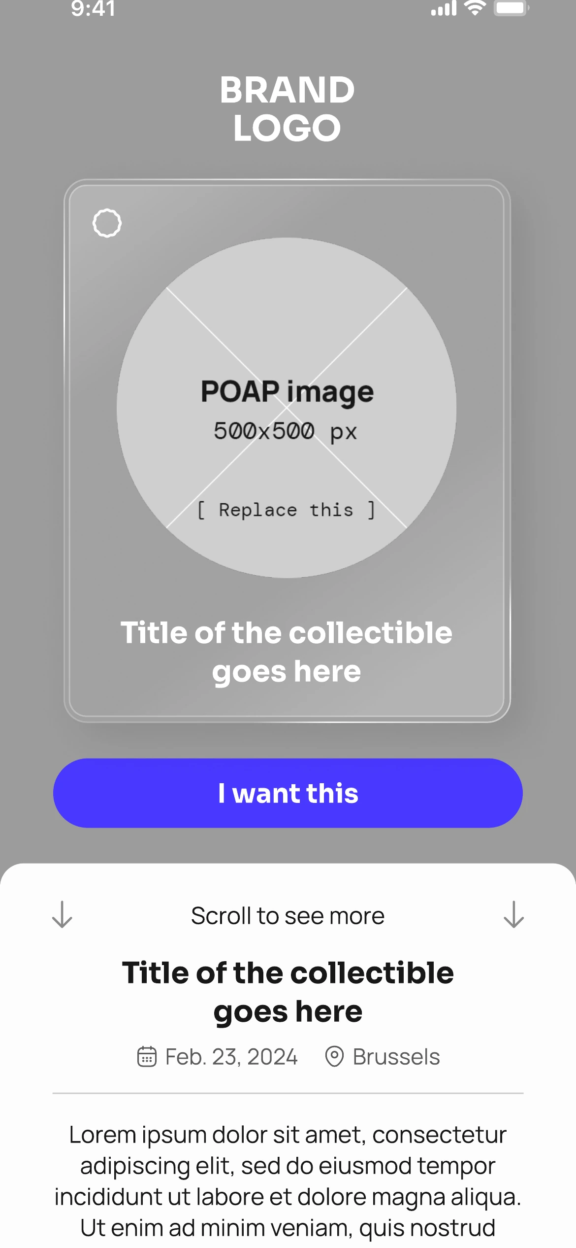
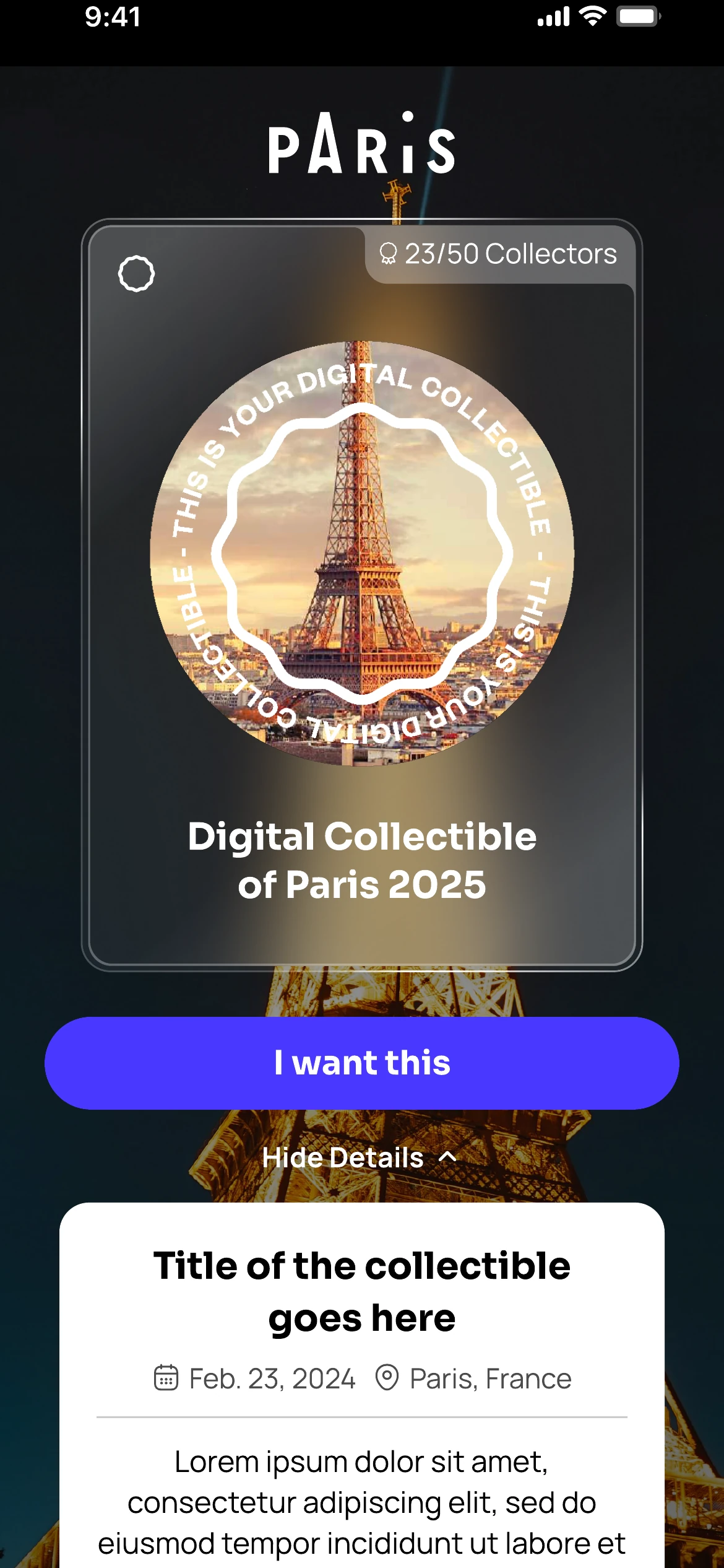
Underneath, claiming a collectible is a transaction: identify the person, check they are eligible, write a record. Every literal version of that flow looks like a form, and a form is the wrong feeling for something a brand is handing you at an event you chose to attend. The audience made it harder. Most people collecting had never held a digital collectible before, and a flow that confused them did not get a second attempt.
I built the claim as a reveal rather than a submission. The collectible is the largest thing on the screen before anything is asked of the participant, the request for an email or a wallet comes only once they want it, and the language stays on what they are getting rather than on the machinery behind it. The same flow carries every collection method underneath, so a brand can change how eligibility is checked without the participant meeting a different product.
Where the happy path runs out
Collecting an item means claiming it, and every claim runs through the same flow: prove you are allowed to have this, then hand it over. Location verification is the version worth showing, because almost none of it is the happy path. It has to explain why the browser is about to ask for a permission, handle the asynchronous check, and give a useful answer in every way it can fail.
Experience: unifying Passport and minting journeys
By 2026, Passport and the standalone Minting Journeys, POAP Studio’s name for a claim flow sold on its own, had become deeply interdependent but were still configured through separate tools. I designed the information architecture and low-fidelity flows for a unified product called Experience, combining claim pages, collections, benefits, branding and distribution into a single administrative model.
The rules underneath it were genuinely complicated: what a benefit depends on, which collectible belongs to which collection, who is allowed to change what, and how far a client should be able to bend any of it. Modelling that was not the hard part. The hard part was that three completely different people would have to use the same model.
- Minting Journey
- Passport
- Shared configuration
- Experienceone project, one model
Show each role only the complexity it can carry
Experience had to serve three audiences with almost nothing in common. We ran the platform ourselves and knew every rule in it. The brand's senior people had to make decisions across a whole campaign without knowing the system underneath. And the person who actually sat down to build the experience was often the most junior employee on the team, with no technical background at all. An interface that satisfied us would have been unusable for them. One that was safe for them would have made the platform useless to us.
I made complexity conditional on the role instead of flattening it for everyone. SuperAdmin, which was us, sees the whole model. Admin gets the decisions that span a campaign, with real flexibility to set rules, but without the internals that only matter to whoever operates the platform. Editor gets the filling in: which collectibles exist, the copy, the branding. Nothing is taken away at the lower levels, it simply is not that role's problem, so anyone with the knowledge to go deeper can still reach the furthest level of customisation.
Selected outcomes
These are outcomes from individual implementations, not one aggregate metric. Participants, collectors and redemptions are not interchangeable, so each figure stays attached to its own experience. They are four of more than twenty deployments, a sample rather than a total.
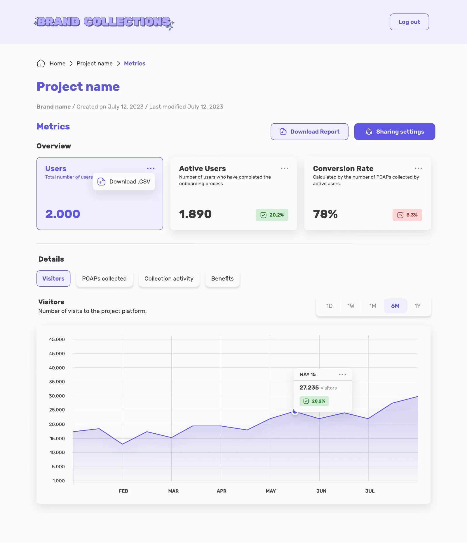
Administrators did not have to wait for someone like me to tell them whether an activation had worked. I designed the metrics view that came with every project, so the people running a Passport could read their own numbers and export them.
- 200
- new users in one day
- 580+
- participants and 700+ benefit redemptions
- 600+
- collectors across Arbitrum experiences
- 65%
- of attendees visited at least two stations
Figures come from the project evidence supplied by POAP Studio and are attributed individually. Where a metric definition is uncertain it is validated before publication rather than rounded up.
Across selected implementations, Passport supported product onboarding, event participation, city exploration and community engagement. There have been more than 20 direct deployments, including MetaMask, Cannes, Mantle, Merge Madrid, Mercedes-Benz Consulting, Arbitrum, Toledo Art Museum, BASF, Shell, Linea, ENS, Bayer, VIVA Technology and WWF.
What I would carry forward
Scalable UX needs more than reusable components.
As the platform grew in complexity, I learned that it also requires clear ownership, documentation, design governance and regular implementation reviews to preserve interaction consistency as the system evolves.
That is why the customisation guidelines exist: a written contract with clients about images, fonts and colours, so the system stays coherent when someone else configures it.
If your product has more rules than screens, we should talk.