Porsche 911 GT3 RS
A bespoke NFC collectible experience for owners, and the project that revealed the need for a reusable platform.
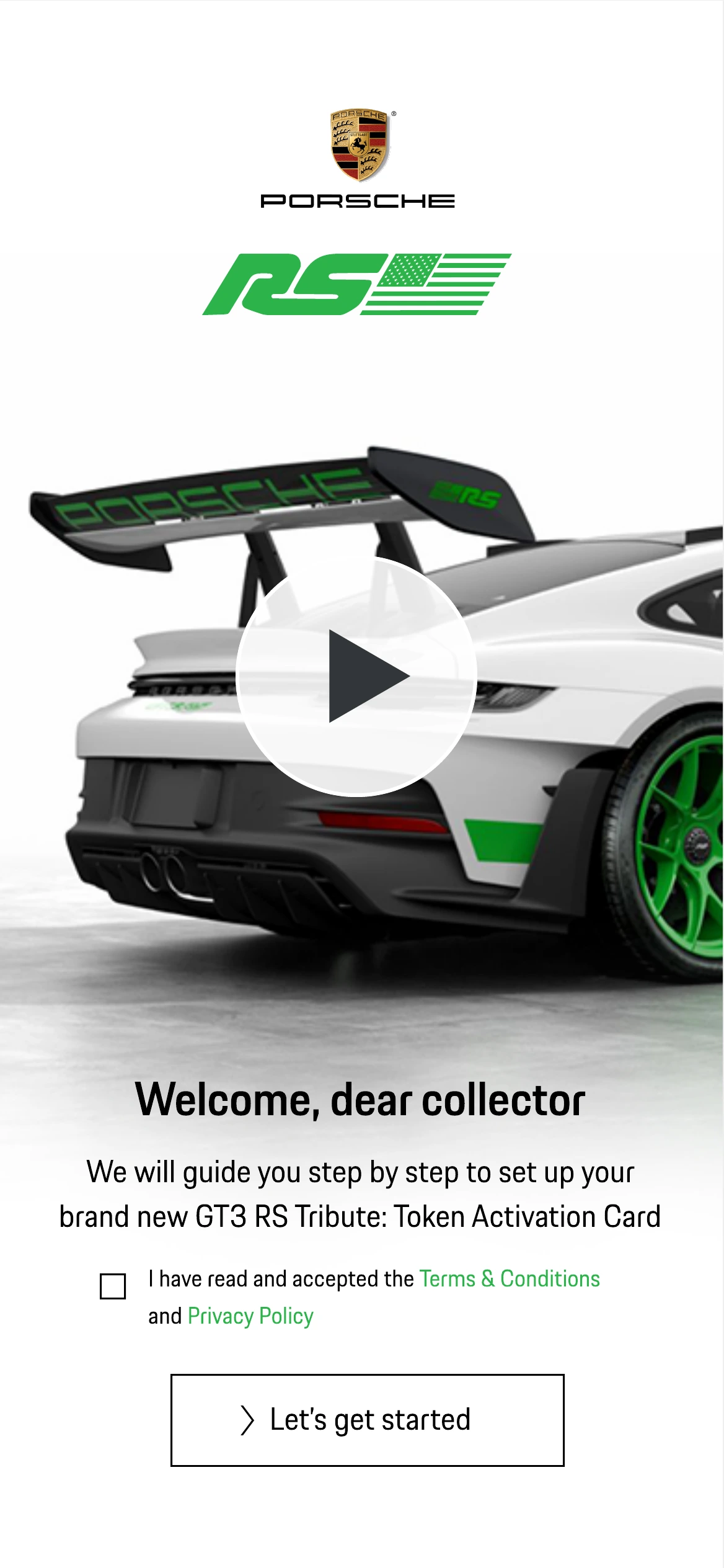
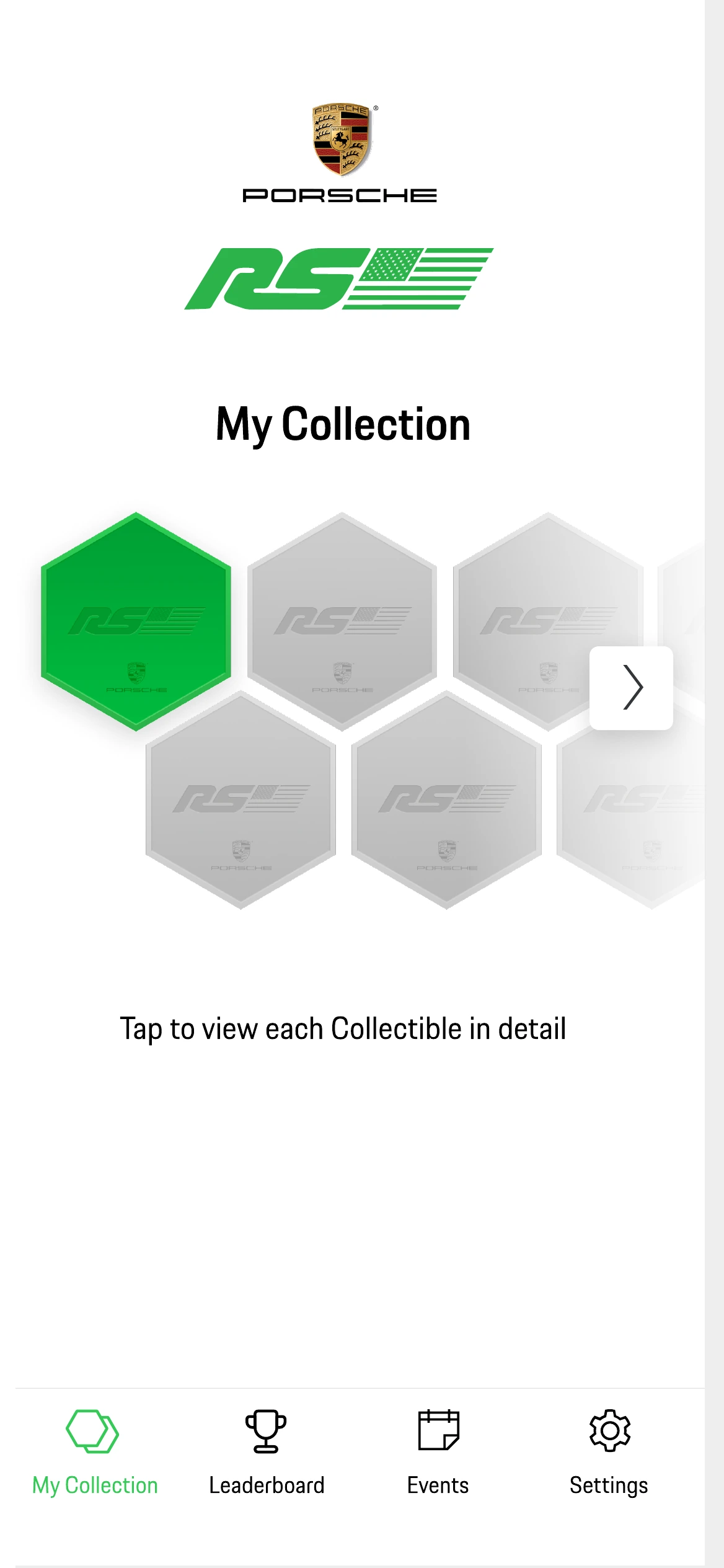
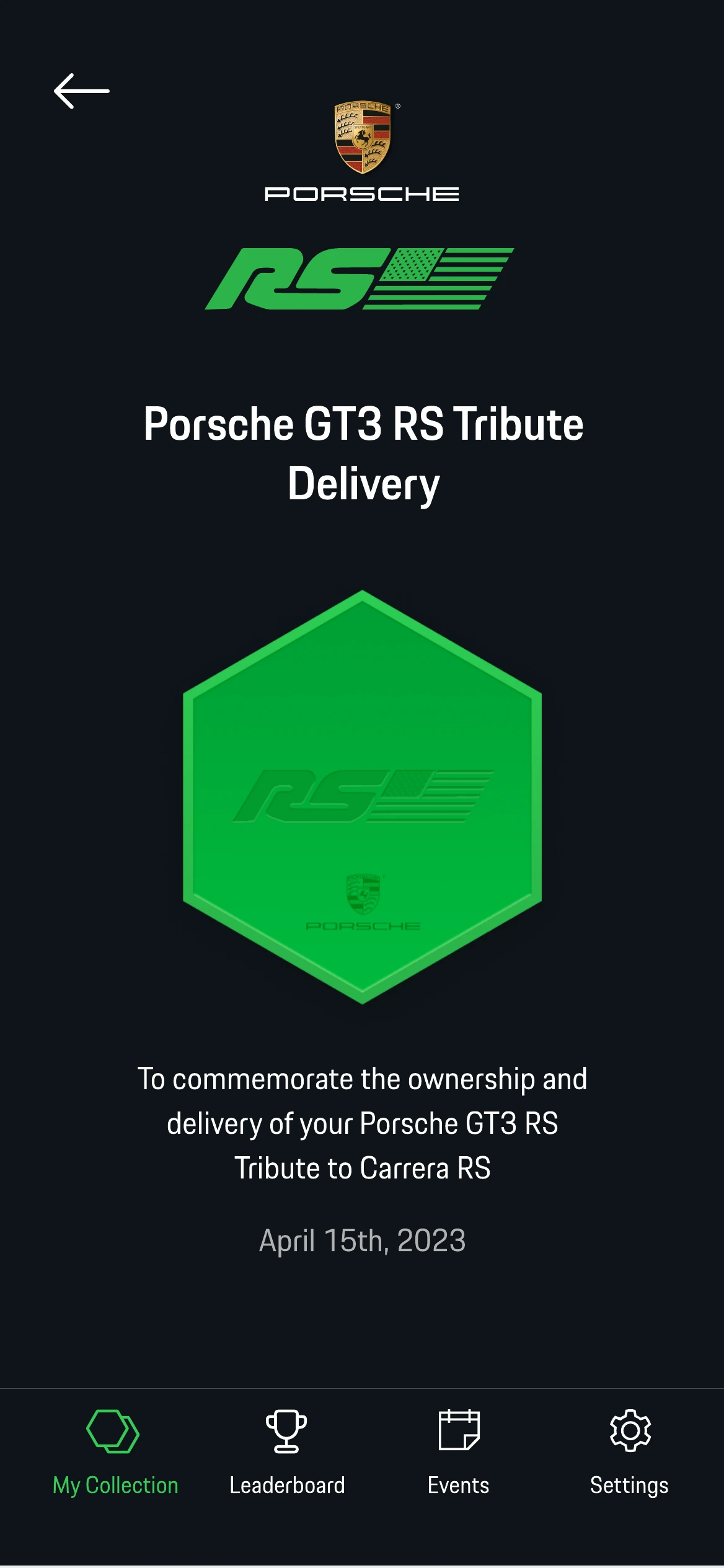
- UX/UI Designer
- 2023
- Launched
- Product journey · Information architecture · UI in two themes · NFC card and terminal touchpoints · Developer handoff
A collectible you hold before you ever see it
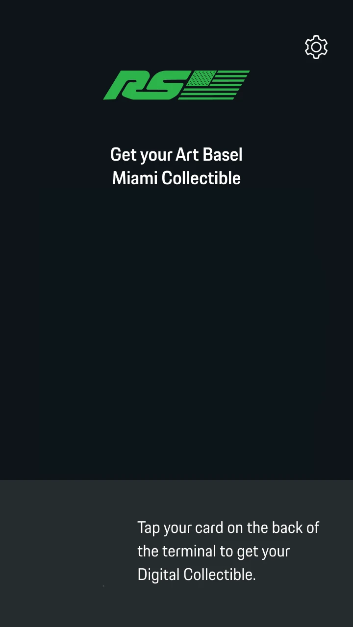
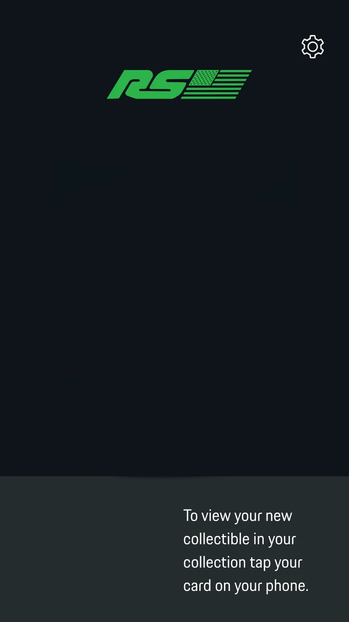
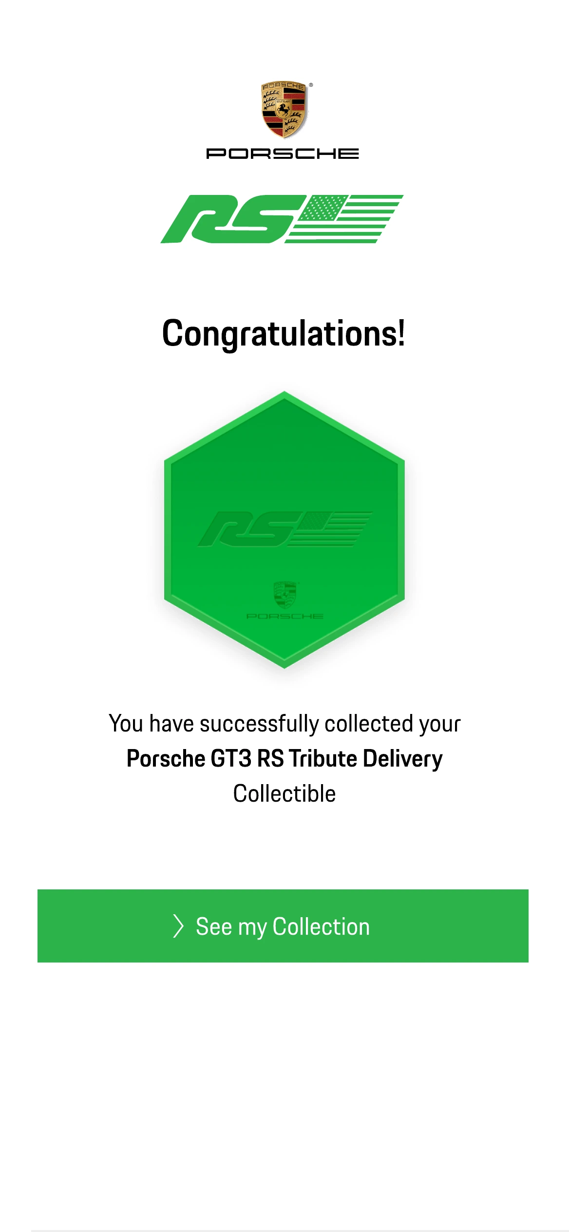
An exclusive NFC collectible experience for Porsche 911 GT3 RS owners. The entry point was not a link or a QR code: it was a printed activation card handed to the owner, and a terminal at the event — the digital product had to feel worthy of that object, and of a car whose buyers notice everything. I designed the complete journey: the card and its instructions, the terminal states, and a full mobile web product in two themes, from first tap through collection, leaderboard, events and wallet management.
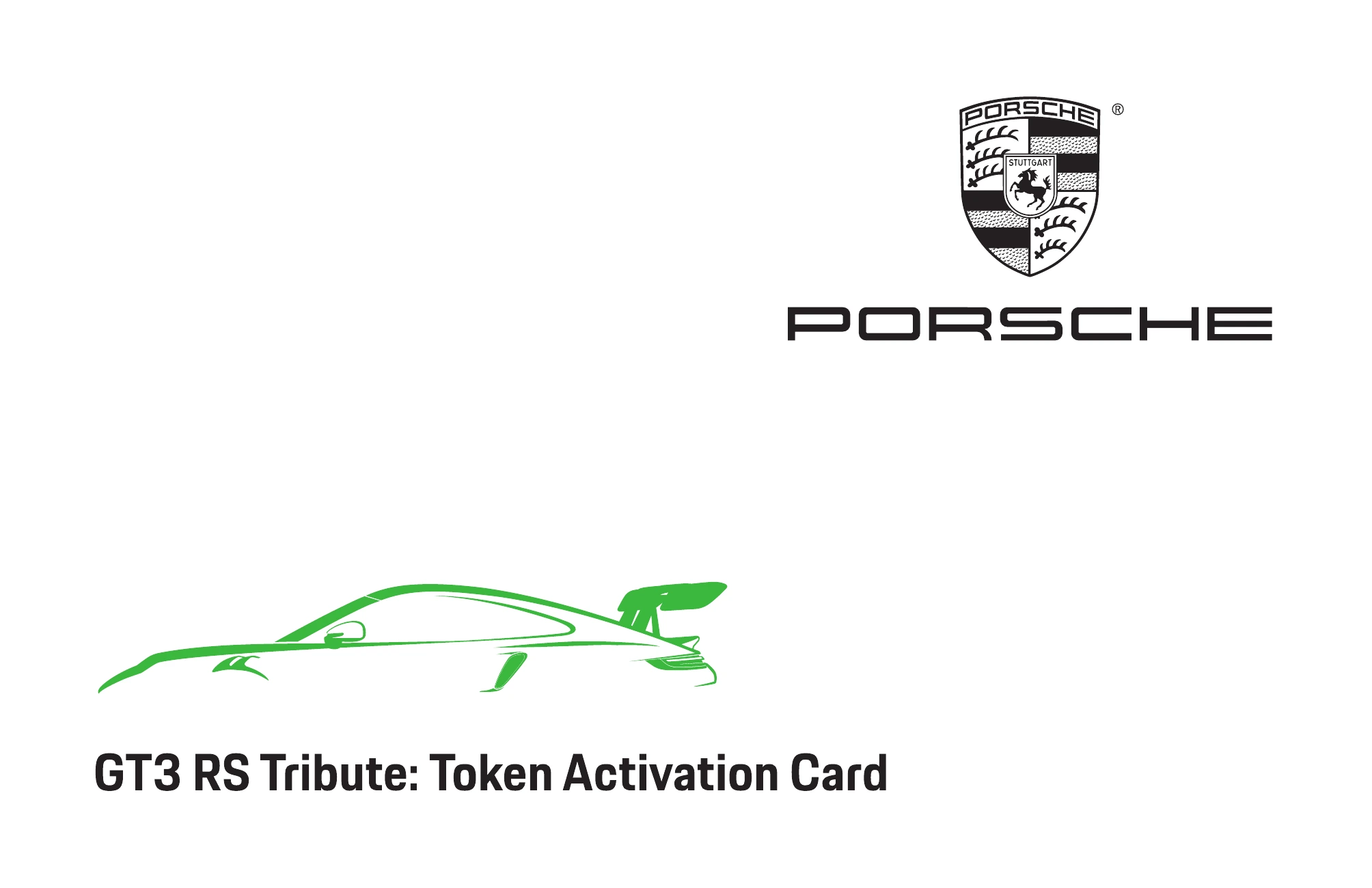

Card, terminal, collection
- Activation cardNFC, handed over
- Terminaltap at the event
- Web appopens on the phone
- Walletcreated or connected
- Collectionthe collectible arrives
Explain a wallet without saying the word first
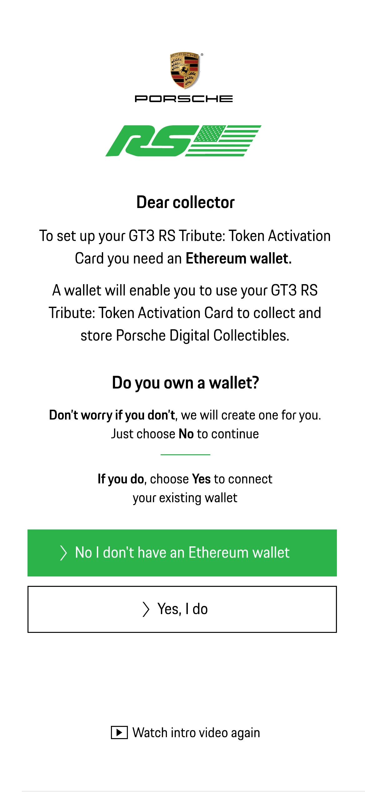
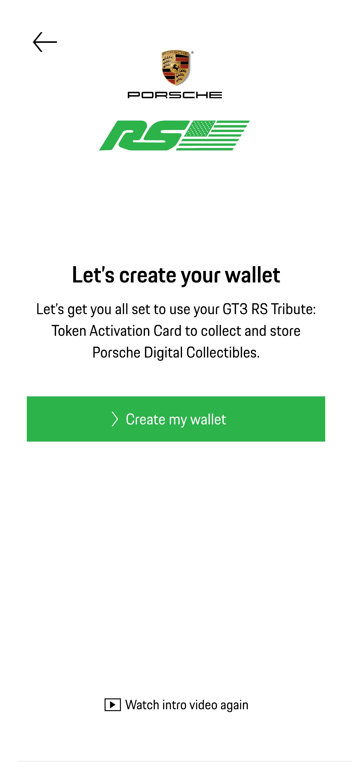
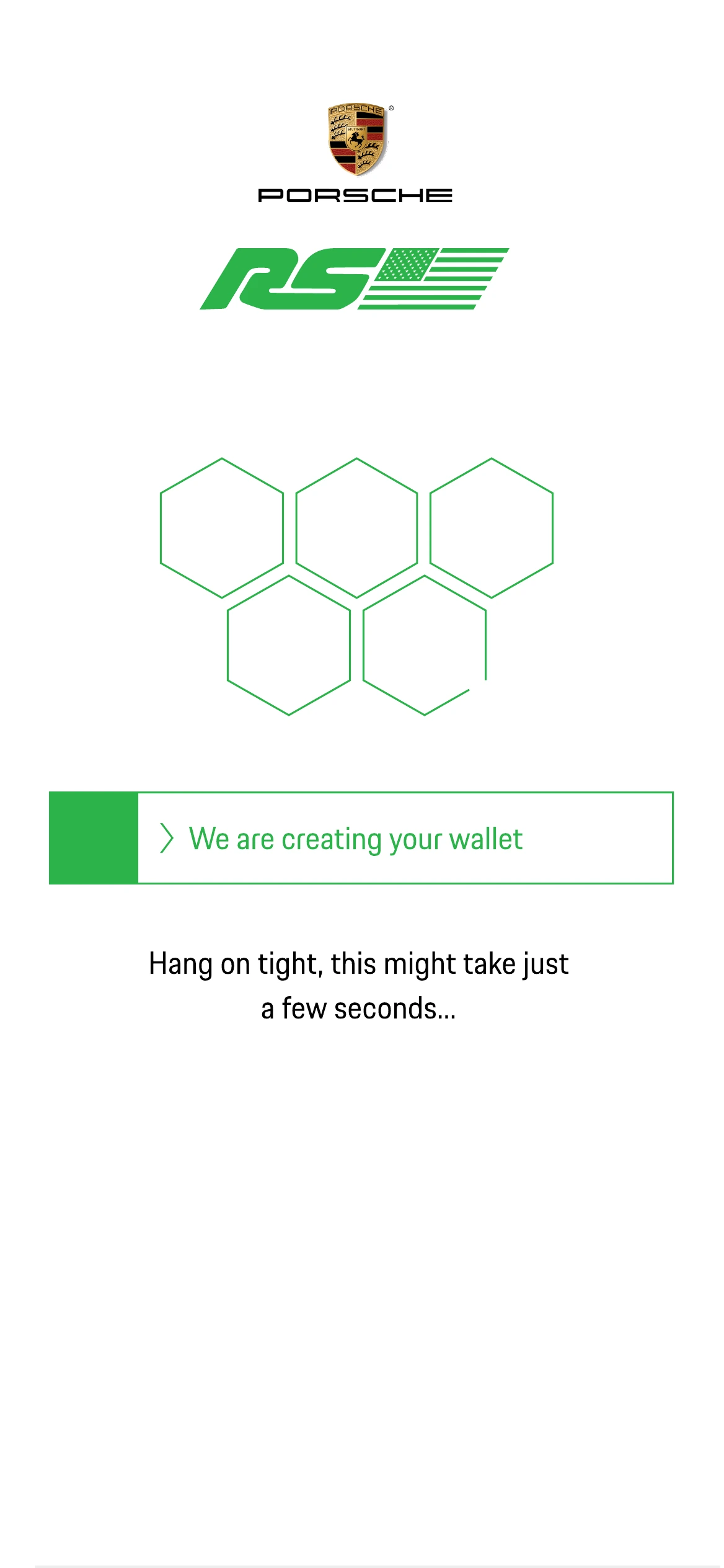
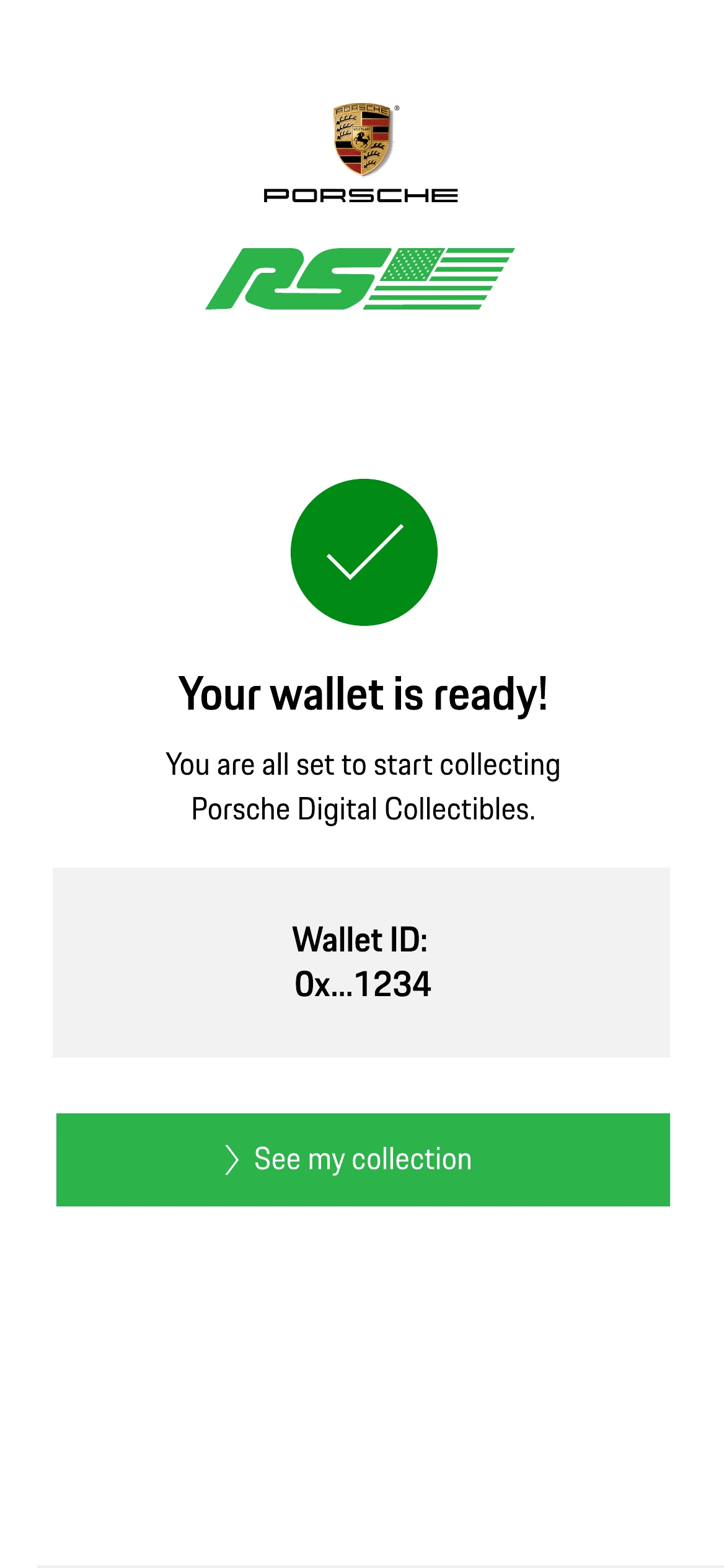
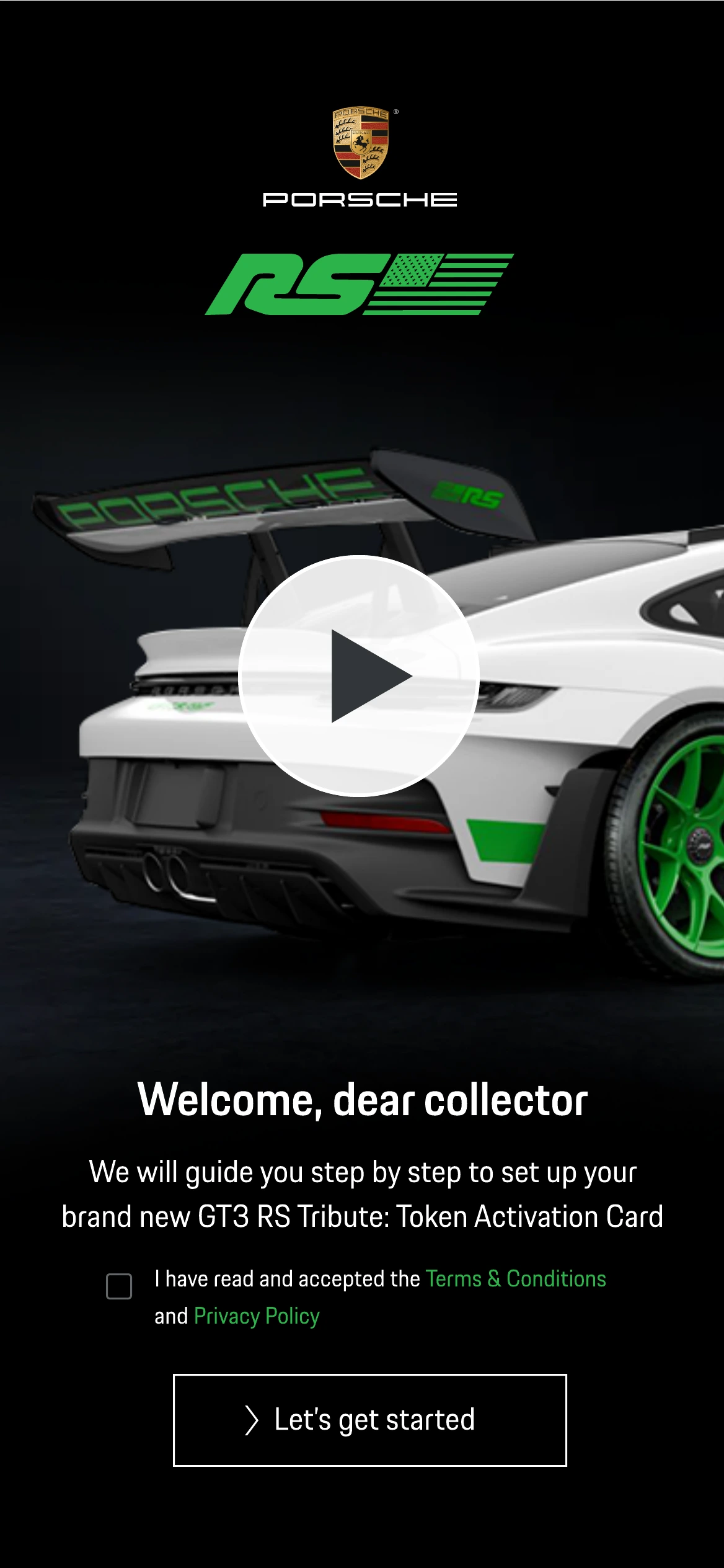
The audience here is a Porsche owner, not a crypto user. The first screen is a video of their own car; the second explains, in plain language and before asking anything, that a wallet is what will hold the collectible, and offers to make one for them.
Two themes, one product
Design every screen twice rather than pick a side
Porsche’s own digital interfaces already worked across both light and dark environments. A single theme for this experience risked feeling like an isolated branded layer rather than something native to that broader visual system.
I designed the complete product in light and dark, as one system rather than two skins: the same layout, the same hexagon geometry, the same green as the single accent, with surface and text roles swapping. Every state in the flow, including errors, empty states and modals, exists in both.
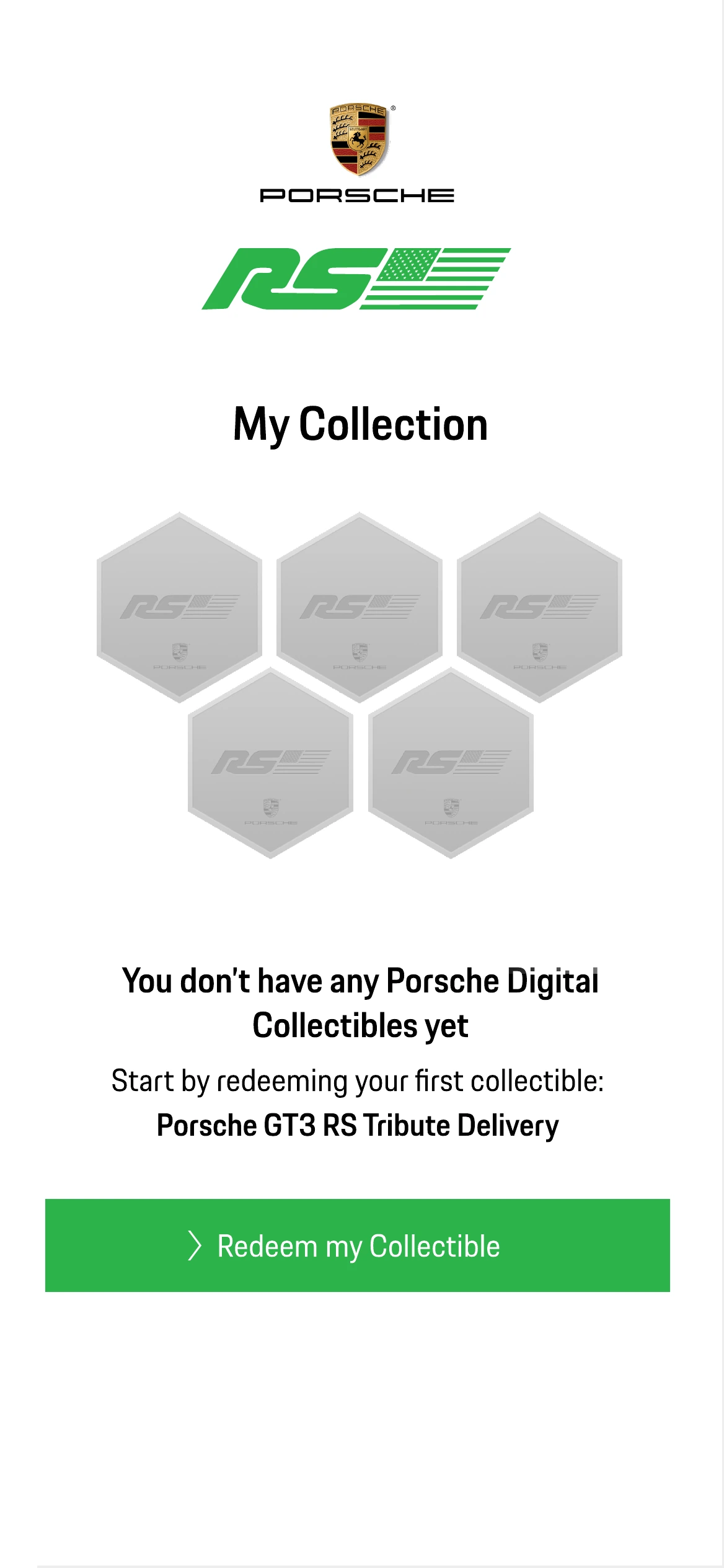
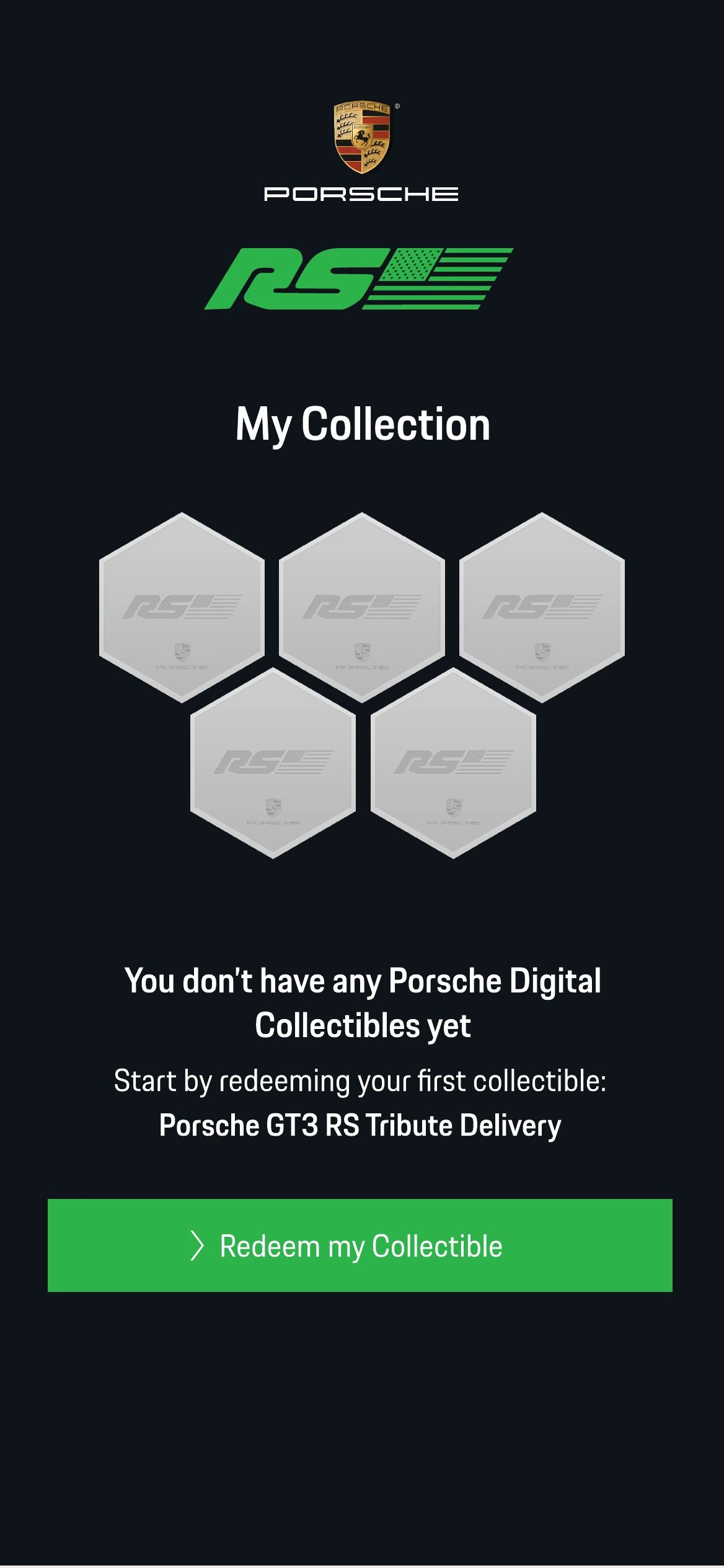
The collection, and what it means to be empty
The collectible is a hexagon, a shape borrowed from the car’s own design language rather than invented for the app. The collection grid uses it at three levels of state: filled and green when owned, outlined and grey when not yet collected, and flat grey when the collectible belongs to an event the owner did not attend.
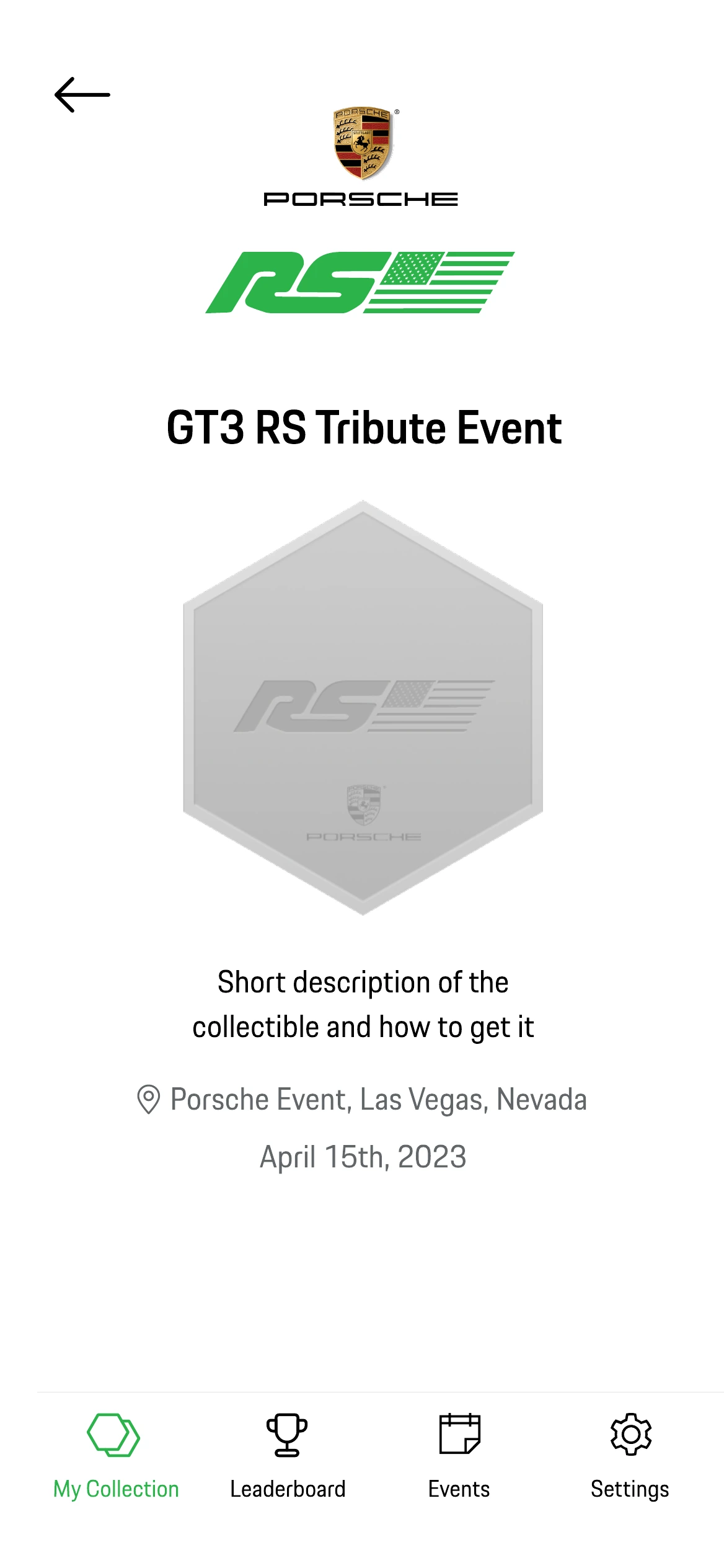
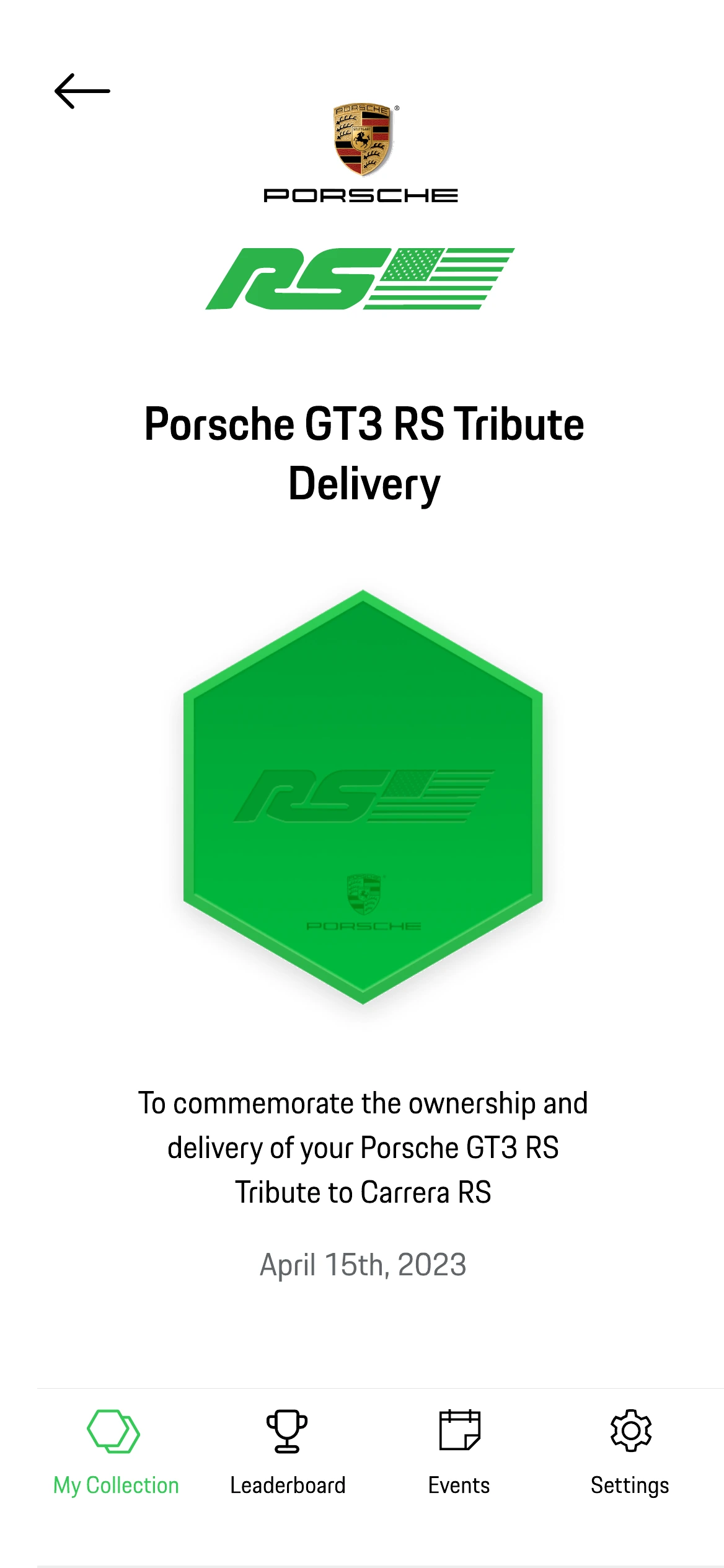
The empty state is the first screen most owners will ever see.
So it does not say “nothing here yet”. It names the collectible they already own by right, the one commemorating the delivery of their car, and gives them a single button to redeem it. The product starts with a gift, not with a void.
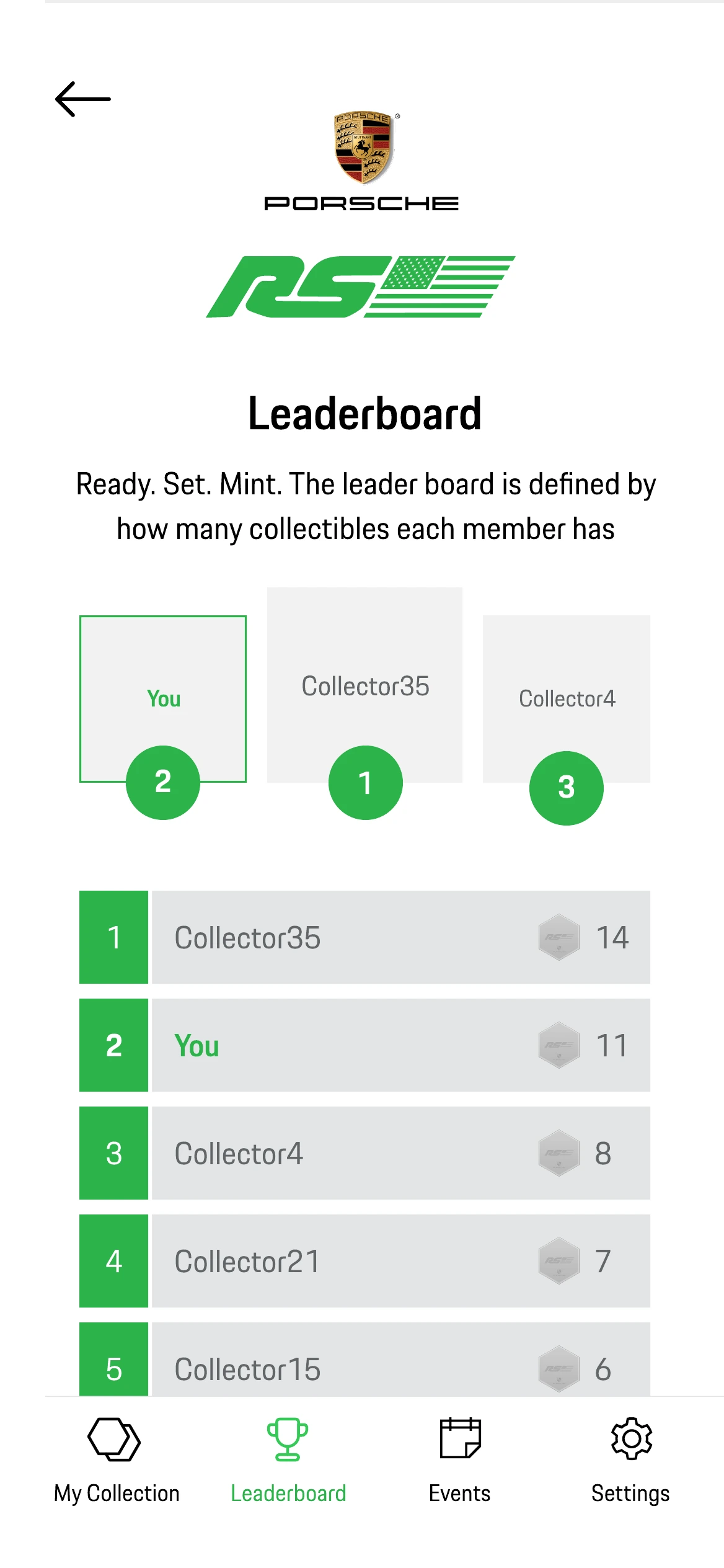
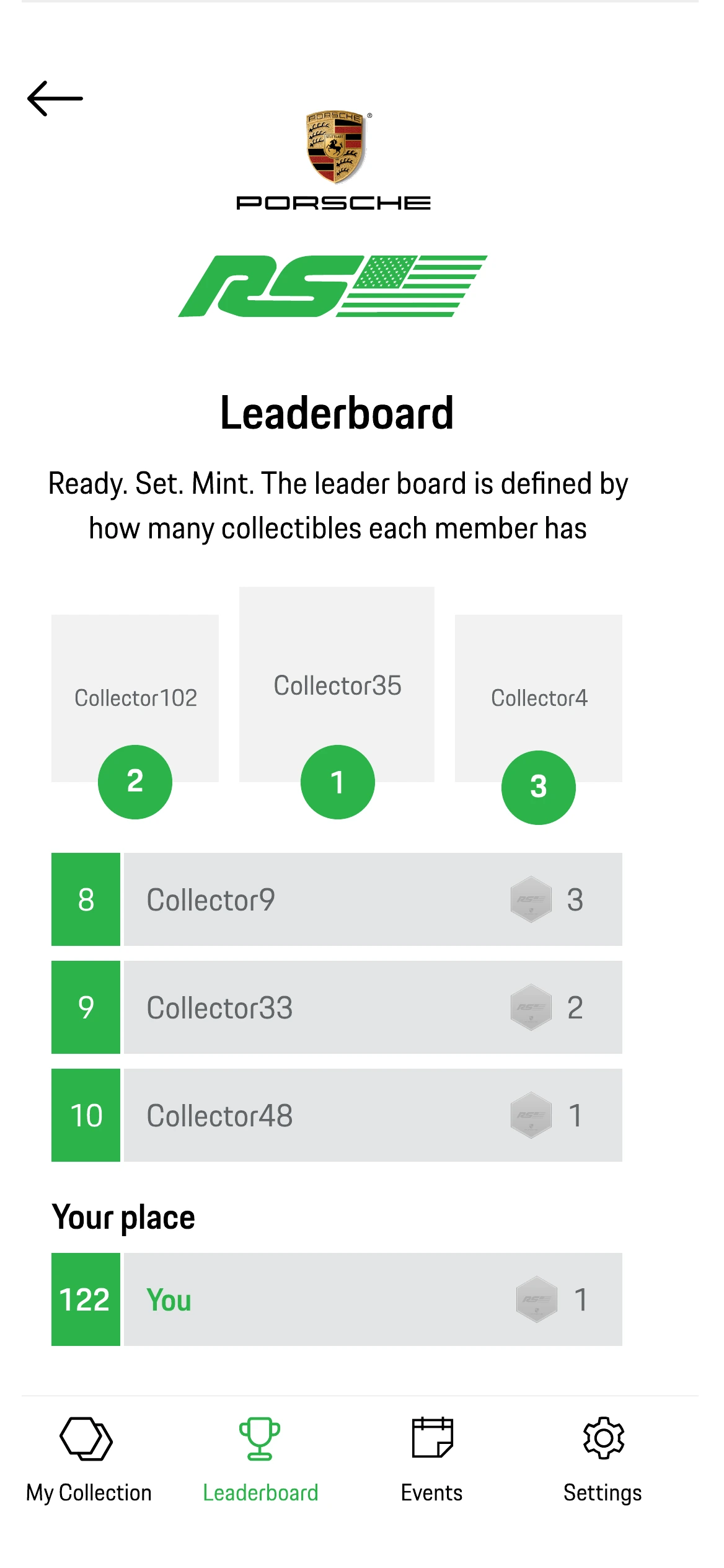
A leaderboard that never shows you nothing
Open the leaderboard at the reader’s own position
A ranking of collectors is motivating for the top ten and demoralising for everyone else. Owner 122 opens a list of names they will never catch, sees no reason to scroll, and closes it.
If the owner is not in the top ten, the page still opens at the top, but a pinned Your place row carries their real position, and the list scrolls automatically to show them in context. The same component renders both cases; only the anchor changes.
Events, wallets and the parts nobody demos
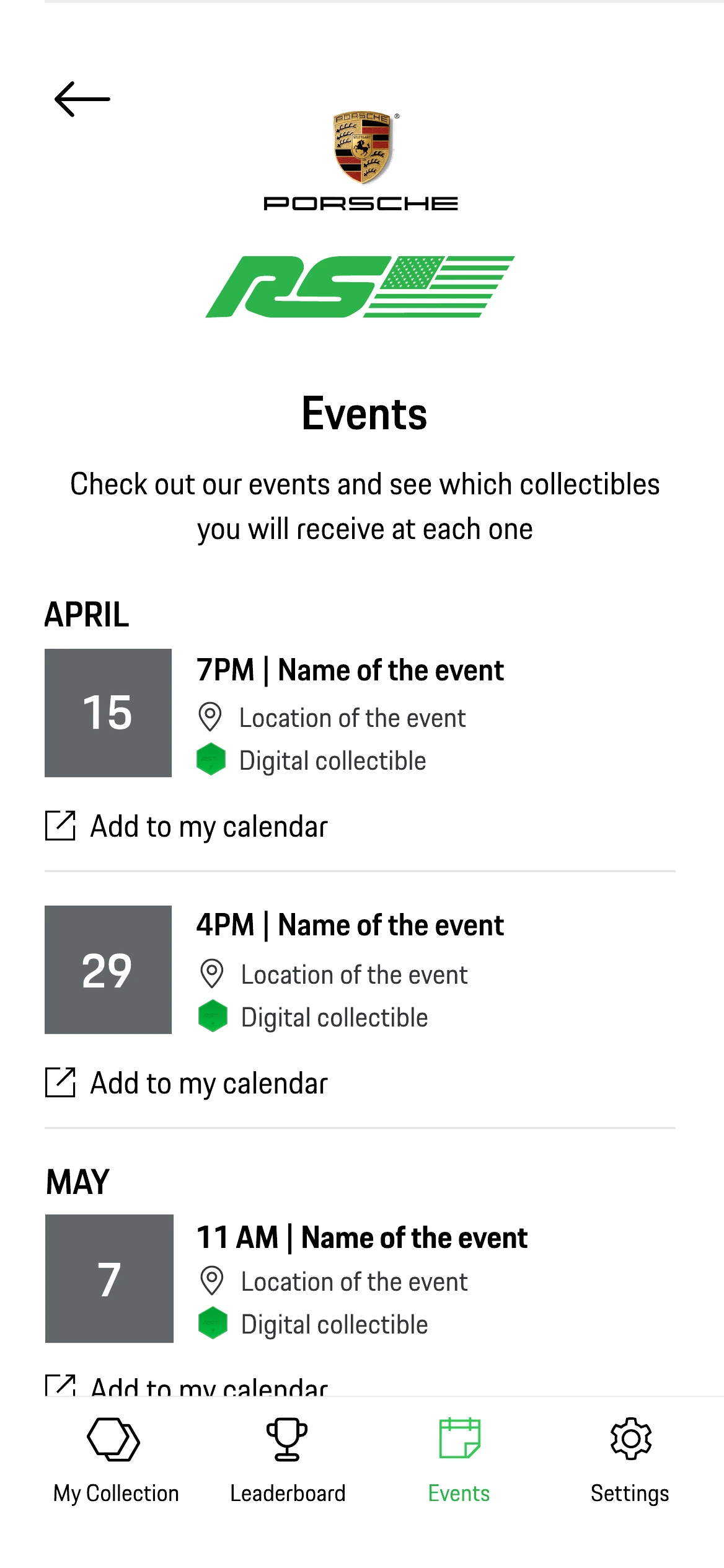
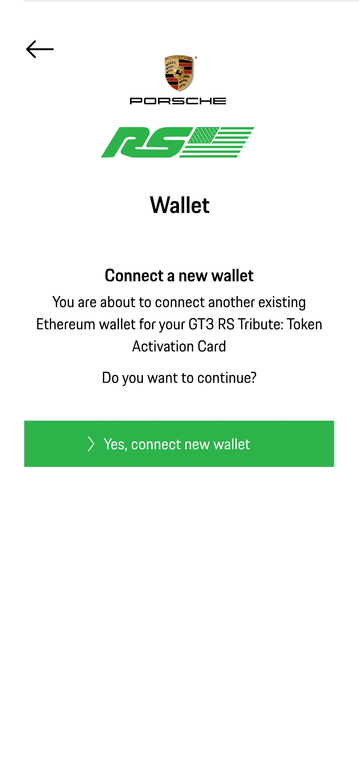
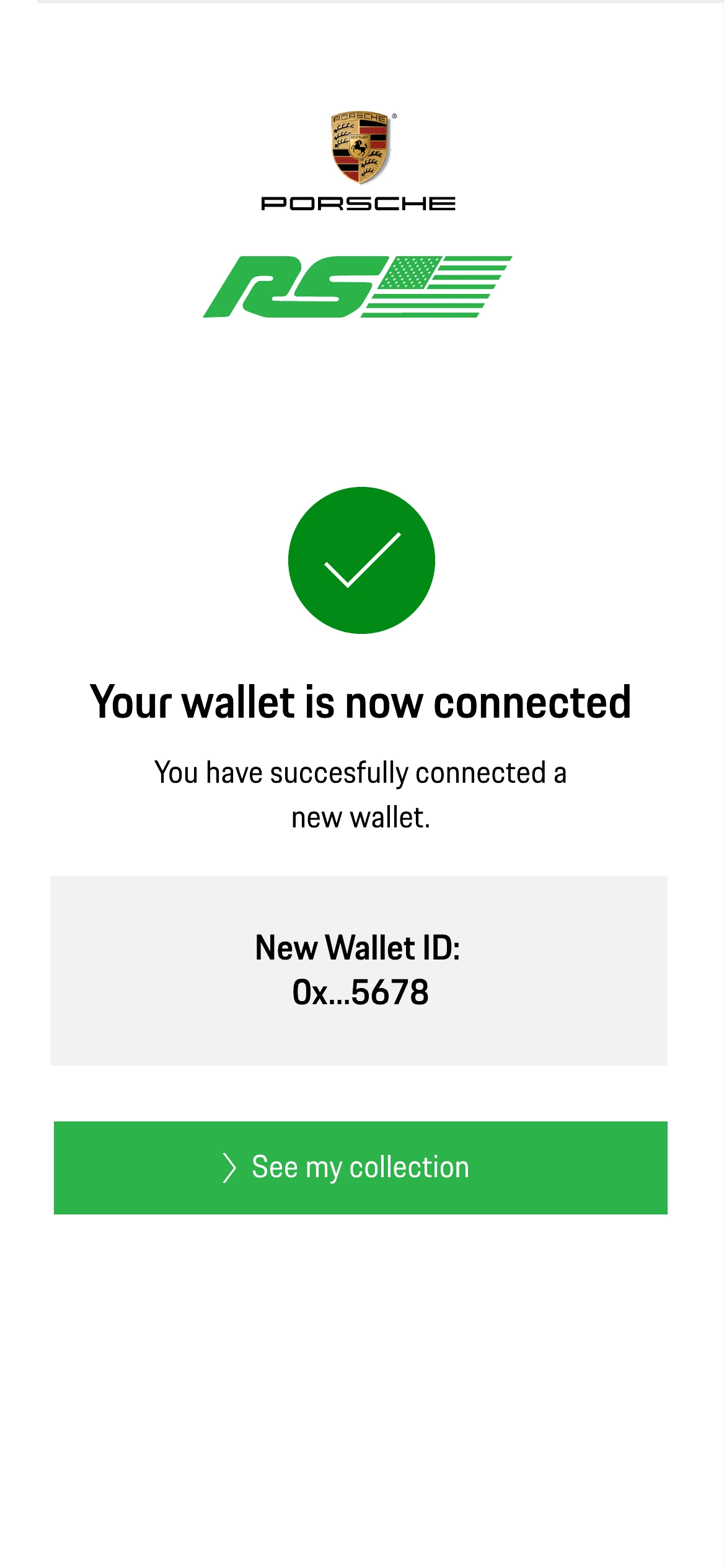
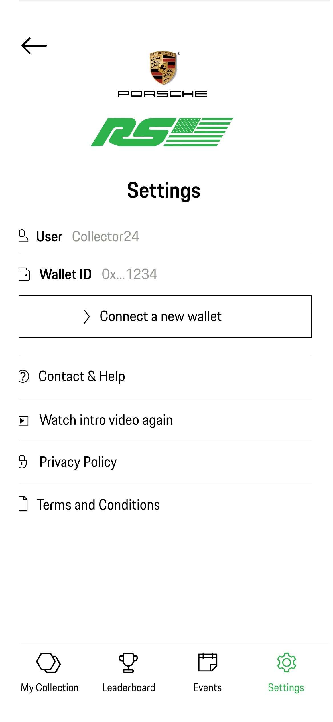
Collecting is only part of the product. Owners need to know which events will hand out which collectibles, be able to add one to their calendar, connect a second wallet without losing the first, and reach a human being when something goes wrong.
What shipped, and where it broke
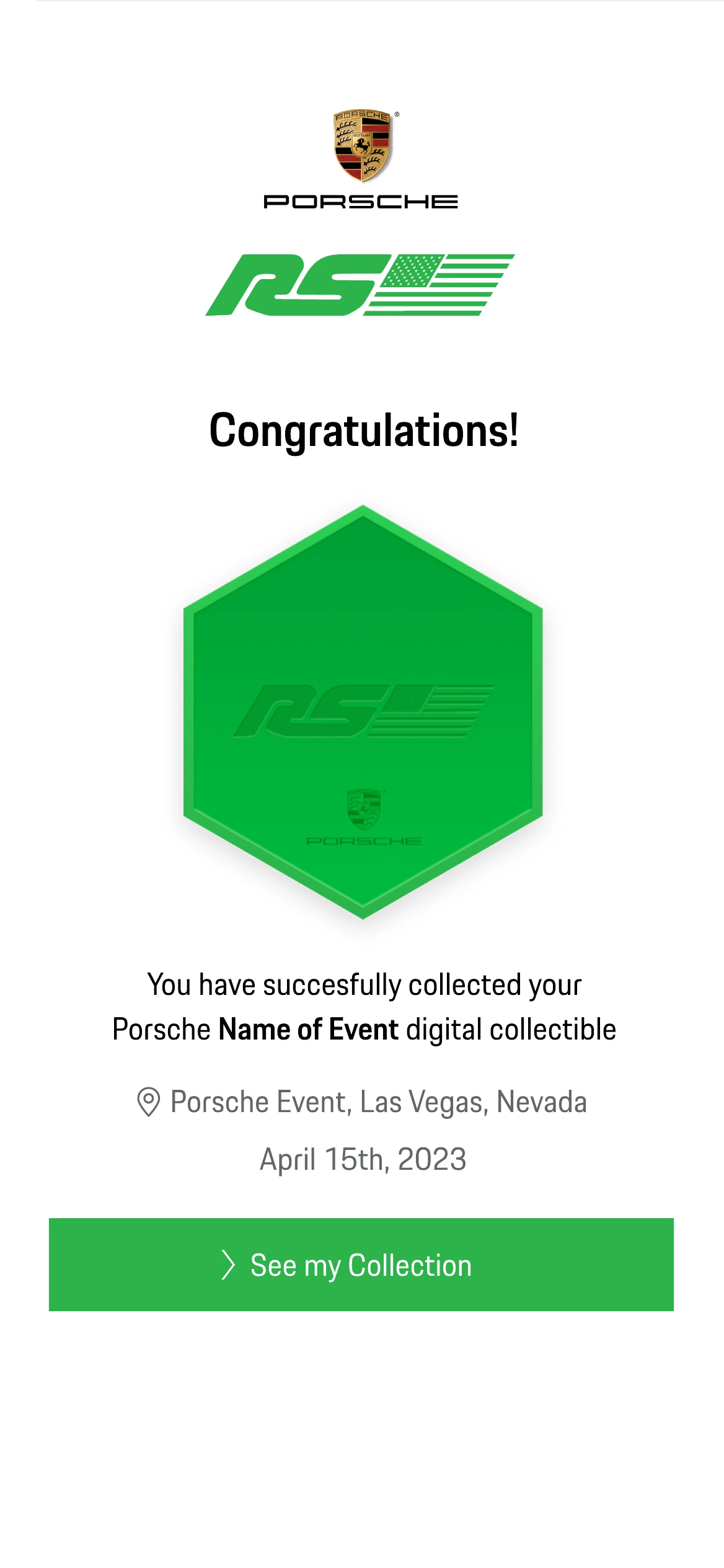
The product launched. These are captures from the live build rather than from Figma. Lower resolution, and kept that way on purpose: they are implementation evidence, not design work.
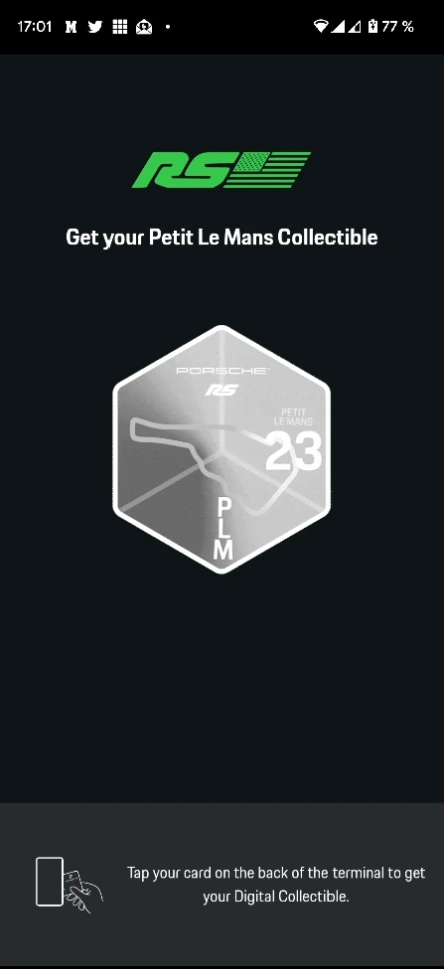
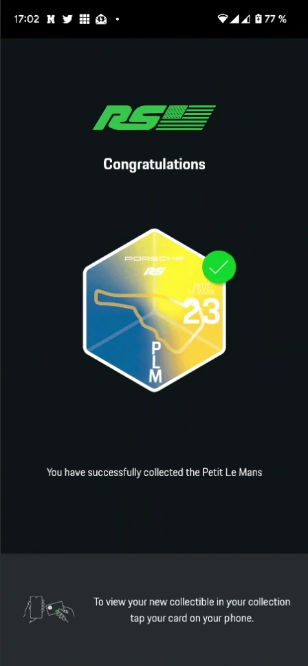
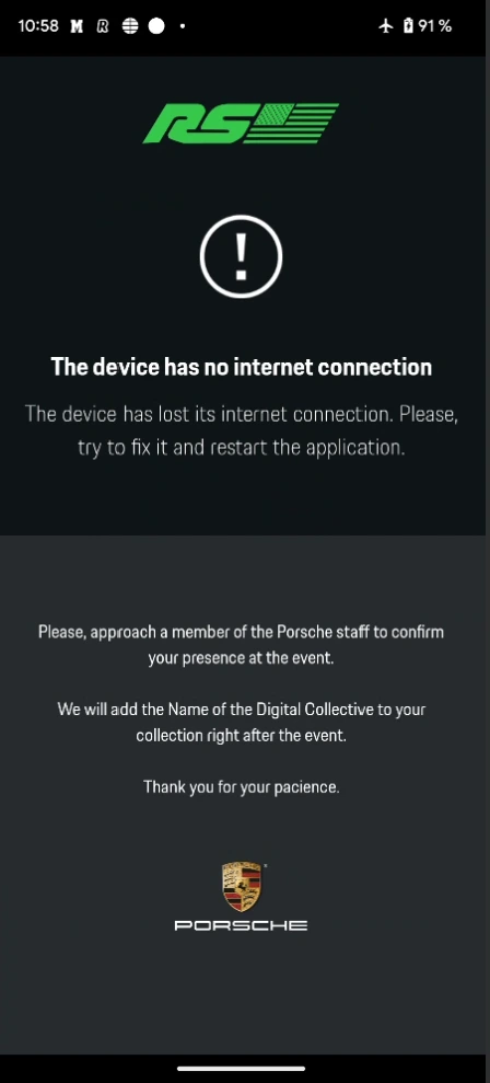
Why reusable infrastructure became increasingly important
Porsche didn’t create the platform idea. It made the scalability problem impossible to ignore.
POAP Studio was already exploring how to turn bespoke activation work into a reusable product. Porsche made that challenge especially tangible: the experience justified a highly tailored interface — a Porsche-specific visual system, journey and terminal, two full themes — but reproducing that level of customisation for every activation was not sustainable.
That tension helped reinforce the need for a configurable platform: what is reusable, what is genuinely brand-specific, and what has to be configurable rather than redrawn. Those are the questions POAP Passport was built to answer. This case is counted as a bespoke experience and never as a Passport implementation.
If your product has more rules than screens, we should talk.